Appearance
Layout
Layouts use uniform elements and spacing to encourage consistency across platforms, environments, and screen sizes.
Integrating the elements in a structured way is simple, but making the content flow naturally according to the organization's intent and with a hierarchy that transcends across screen sizes consistently is a bit more complicated. Each layout SHOULD allow us to identify the most important information and the next action to perform within the interface.
Principles
Predictable: Use intuitive and predictable layouts with consistent UI regions and spatial organization.
Consistent: Layouts SHOULD use grids, keylines, and padding consistently.
Responsive: Layouts are adaptive. They react to input from users, devices, and screen elements.
Design guidelines
Anatomy
Layout regions are the foundation for interactive experiences. They’re a layout’s building blocks and are composed of elements and components that share a similar function. Layout regions CAN also group smaller containers such as cards.
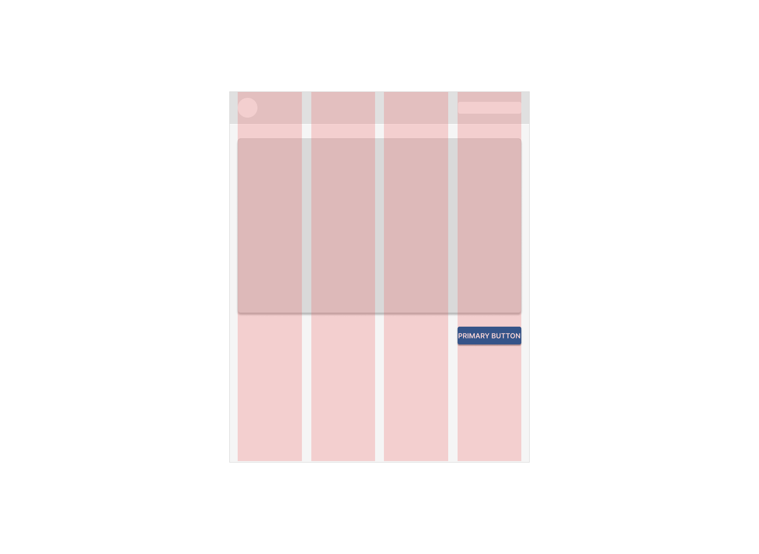
A large screen layout has three main regions:

- App bar
- Navigation
- Body
When creating a responsive layout system, it’s helpful to establish minimum and maximum dimensions for the body and margins, as well as scaling behavior that allows each region to adapt to different form factors.
App bar
The app bar is used to display and group components and actions that help users perform primary actions, or take action on elements in the body region.
Navigation
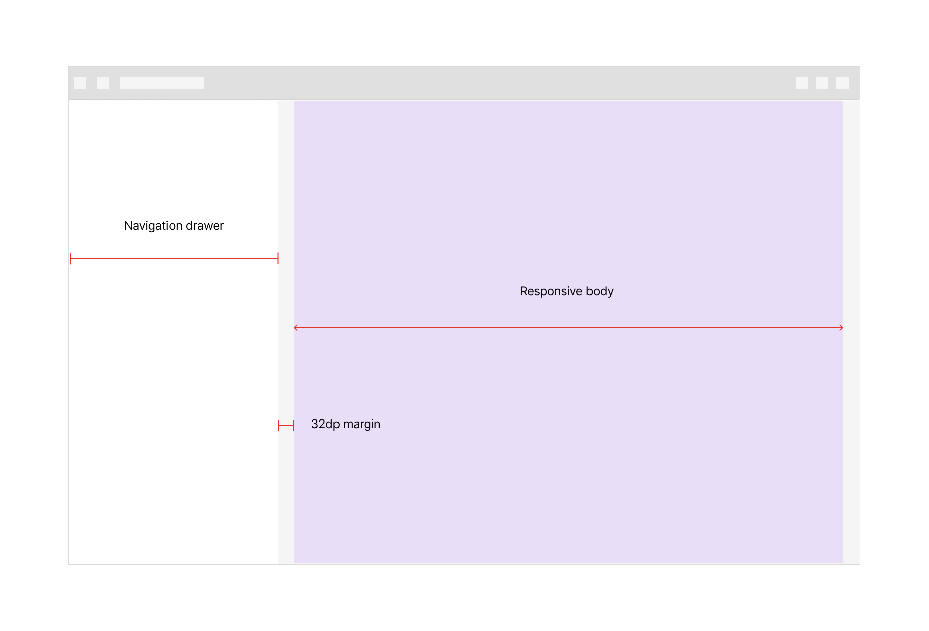
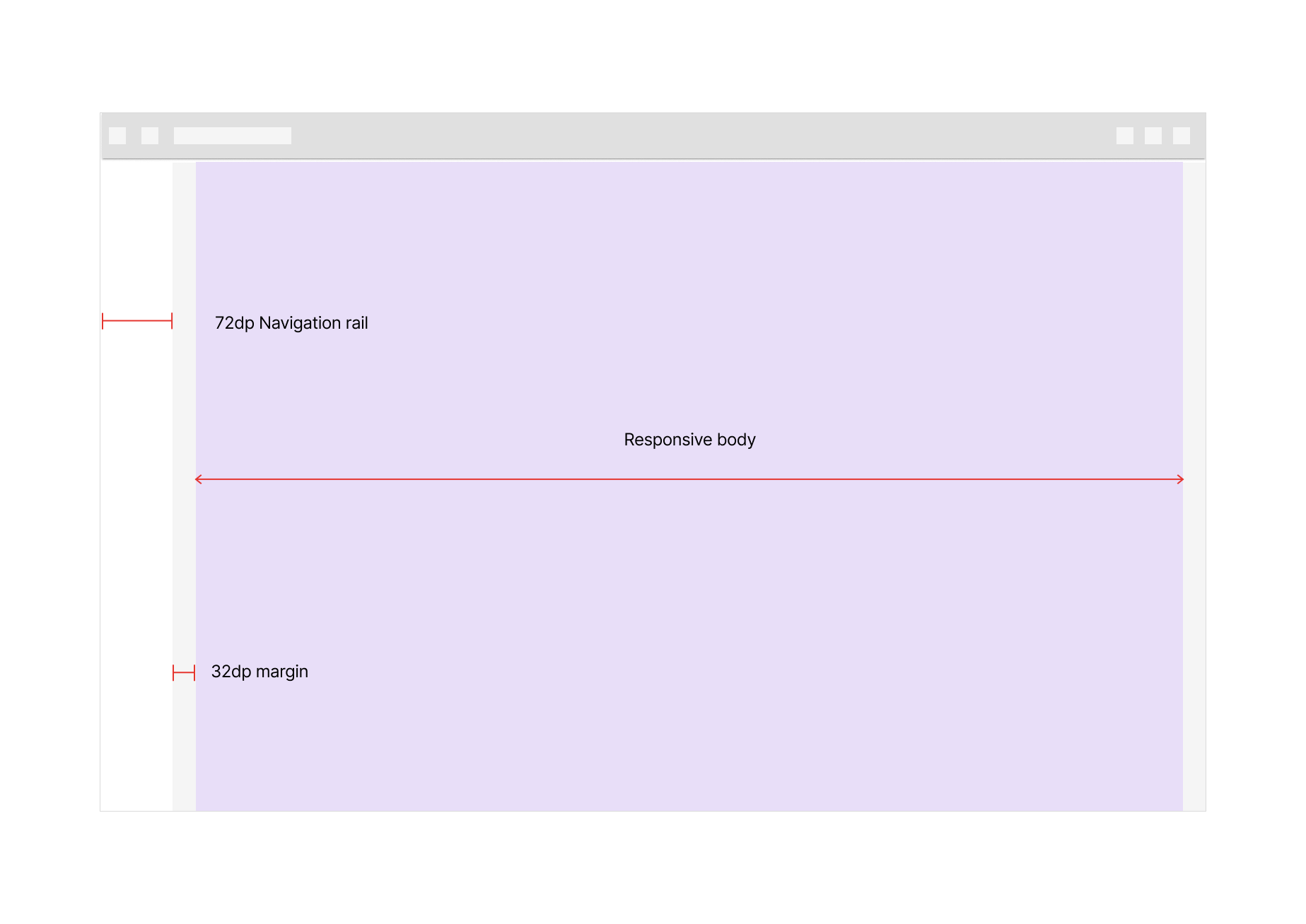
The navigation region holds navigational components and elements such as the navigation drawer or navigation rail. It helps users navigate between destinations in an app or to access important actions. The navigation region maintains a consistent width of 256dp when expanded (drawer); 72dp when collapsed (rail). The background color for the navigation region is white.
If the screen width is below 600dp, a modal navigation drawer CAN fill the navigation region. The drawer appears elevated above the body region.

Body
The body region is used for displaying most of the content in an app. It typically contains components such as lists, cards, buttons and images. The background color for the body region MUST be neutral-100.
The body region uses scaling values for three parameters:
- Vertical and horizontal dimensions
- Number of columns
- Margins
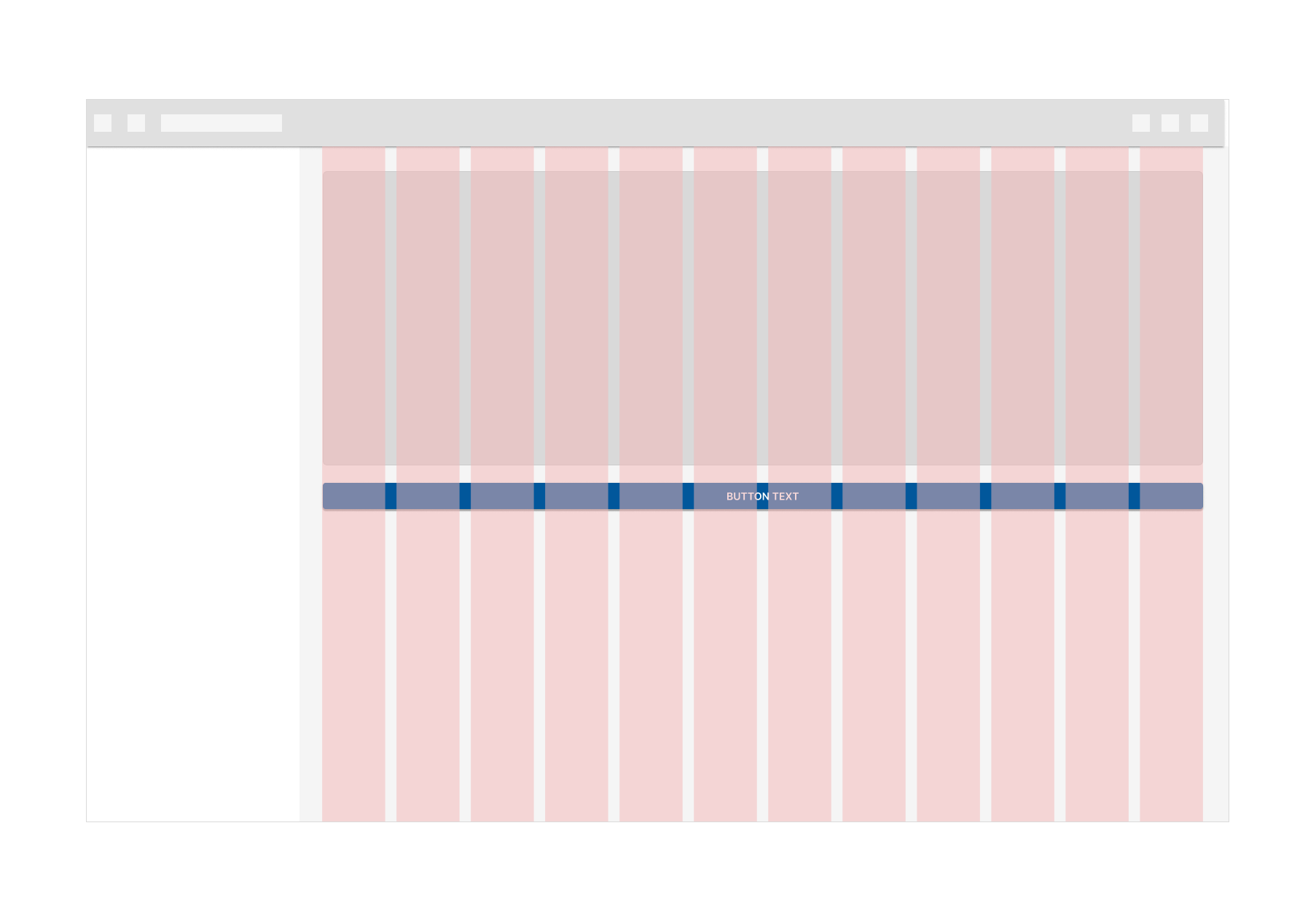
Responsive layout grid
The responsive layout grid provides a convenient structure for the layout of elements within the body region. Components, imagery, and text align with the column grid to ensure a logical and consistent layout across screen sizes and orientations.
The responsive layout grid is made up of three elements:
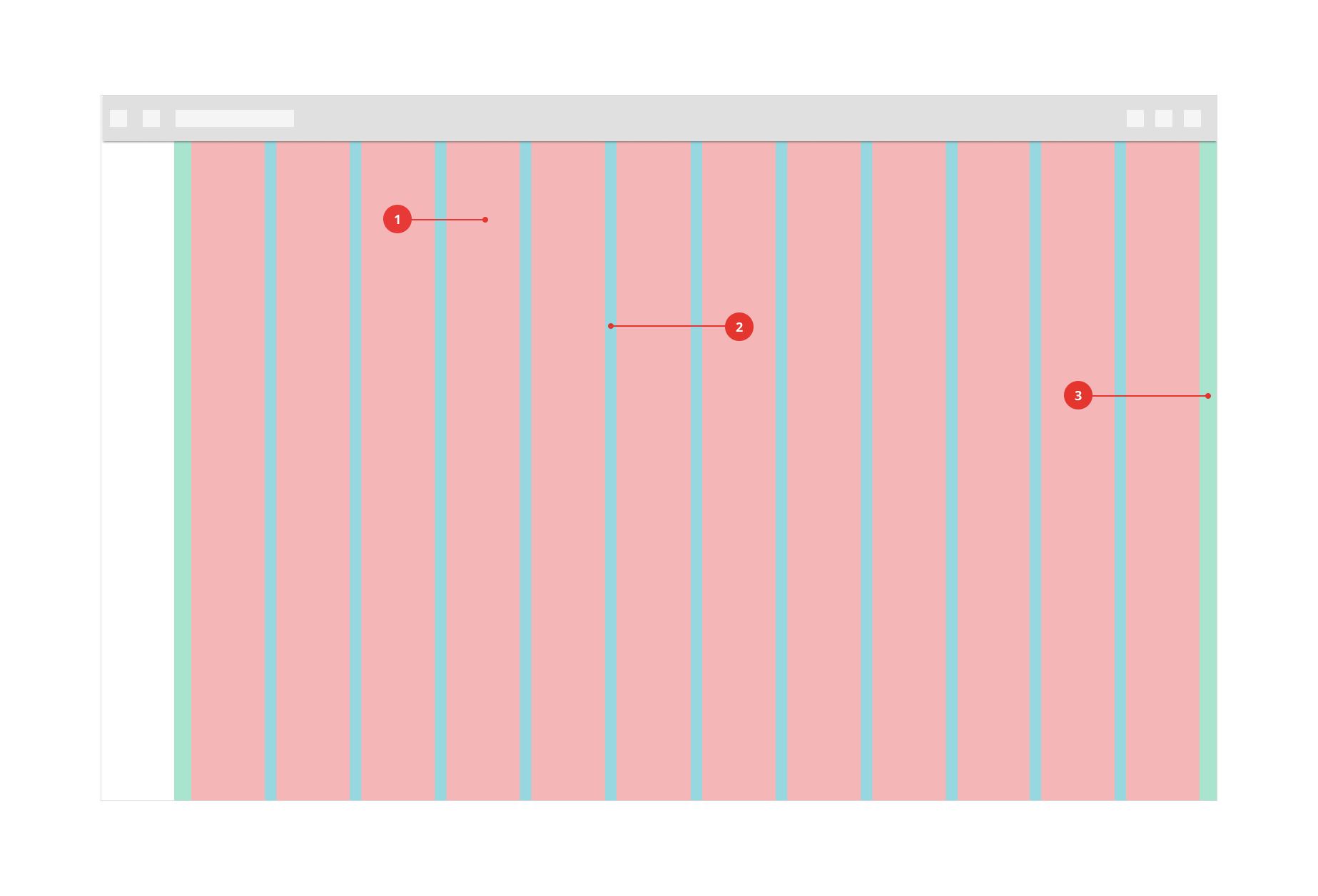
- Columns
- Gutters
- Margins
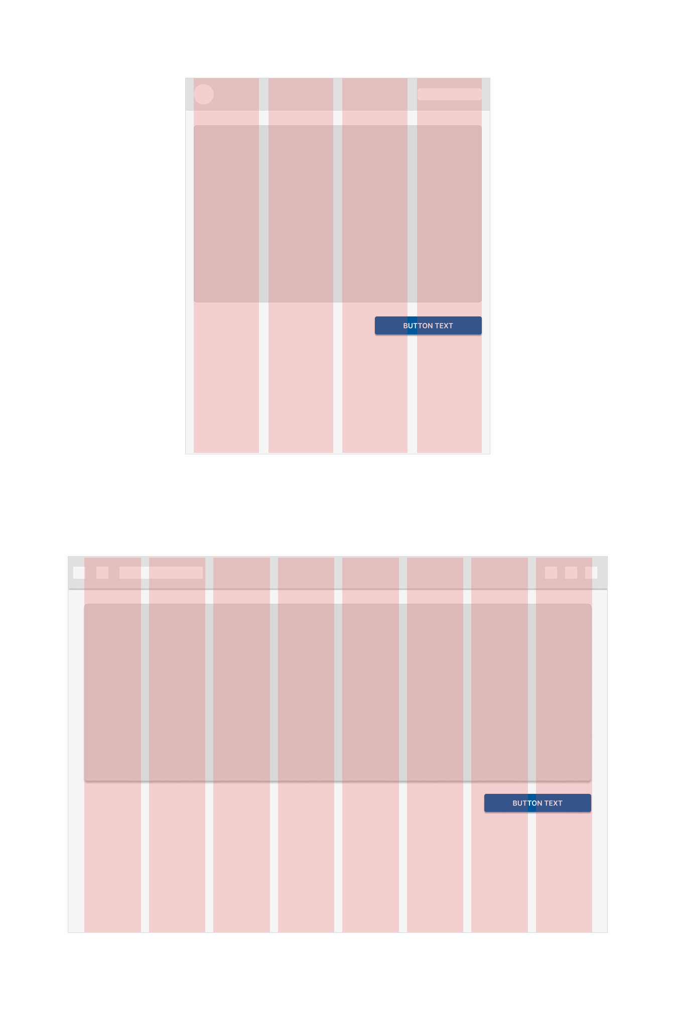
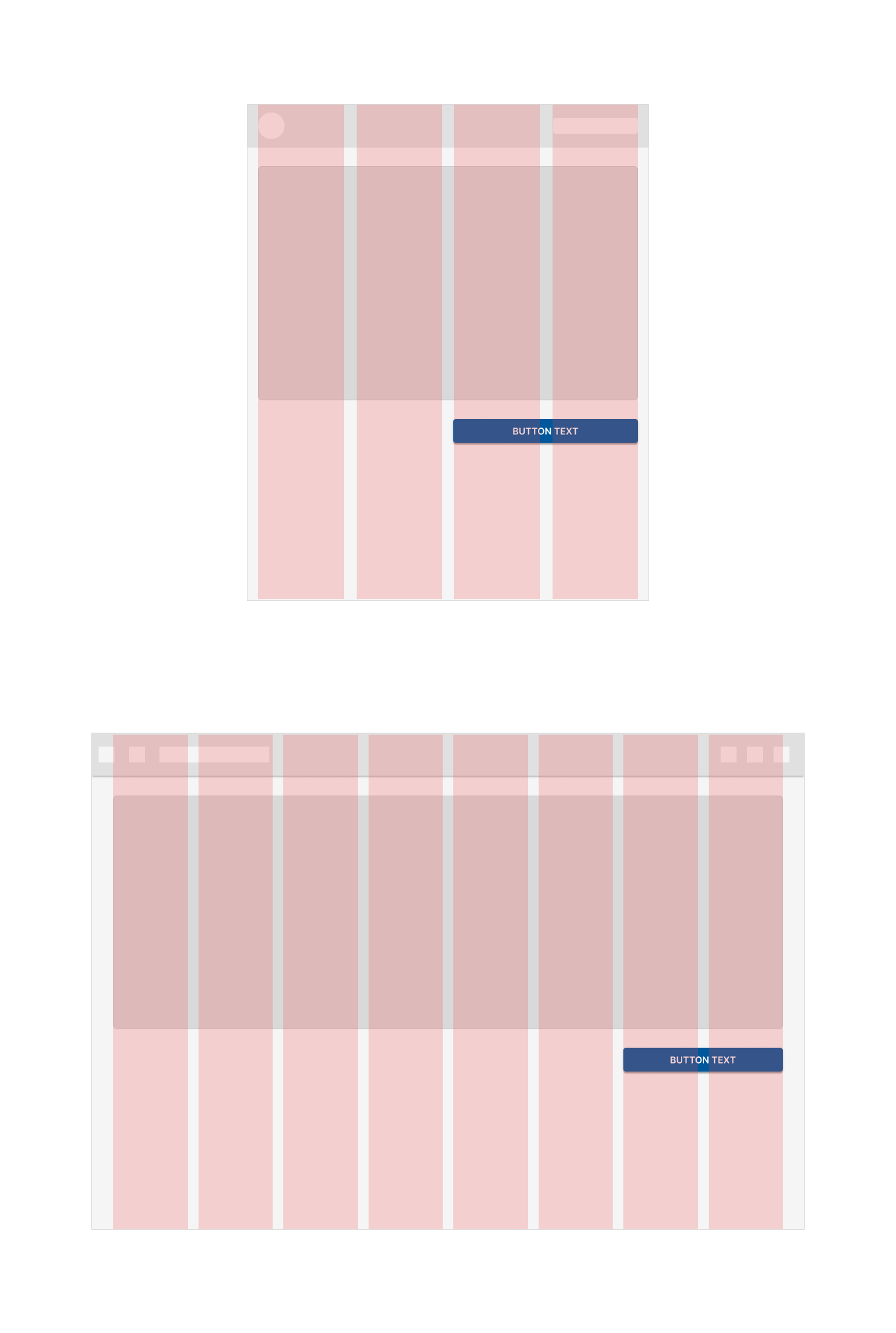
Columns
Content is placed in the areas of the screen that contain columns.
In responsive layouts, column width is defined with percentages rather than fixed values. This allows content to adapt to any screen size. The number of columns displayed in the grid is determined by the breakpoint range (a range of predetermined screen sizes). A breakpoint CAN correspond with mobile, tablet, or other screen type.
On mobile, at a breakpoint of 360dp, this layout grid uses 4 columns

On a tablet, at a breakpoint of 600dp, this layout grid uses 8 columns

At a breakpoint of 905dp, this layout grid uses 12 columns
Gutters
A gutter is the space between columns that helps separate content.
The gutter width is a fixed value at each breakpoint range. To better adapt to a given screen size, the gutter width CAN change at different breakpoints.
Wider gutters are more appropriate for larger screens, as they create more open space between columns.
On mobile, at a breakpoint of 360dp, this layout grid uses 16dp gutters

On a tablet, at a breakpoint of 600dp, this layout grid uses 24dp gutters

Don't make gutters too large or the same width as the columns
 Oversized gutters won't leave enough room for content and may prevent a layout from appearing unified.
The 16dp and 24dp gutters can be used regardless of screen size
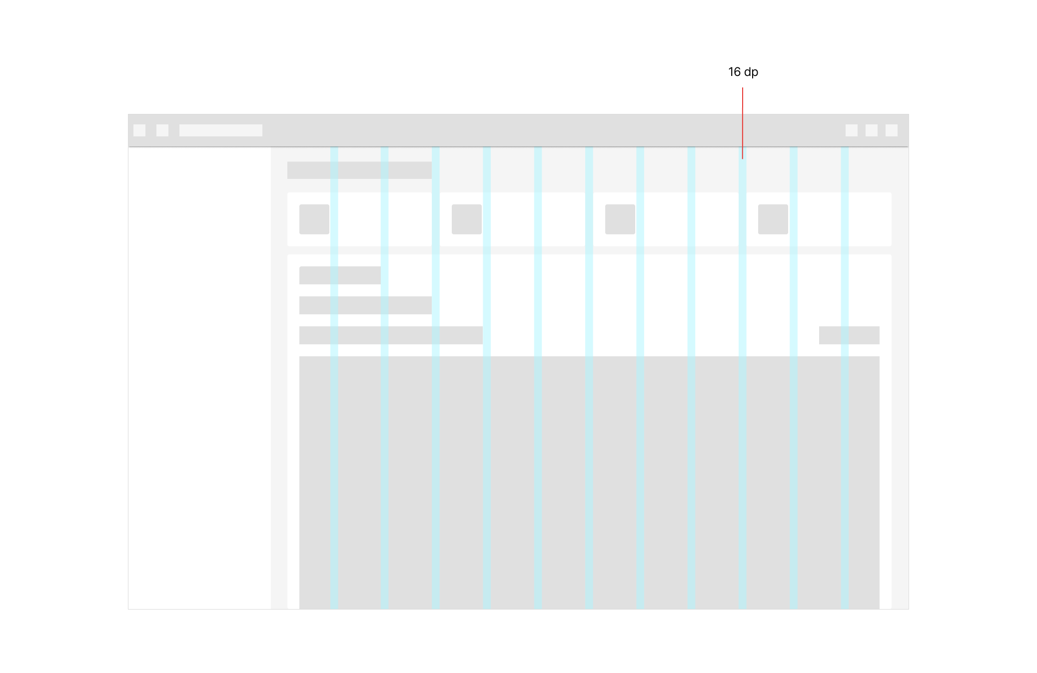
In case the elements on the screen need to display more information and the space needs to be optimized, we CAN opt for 16dp gutters.
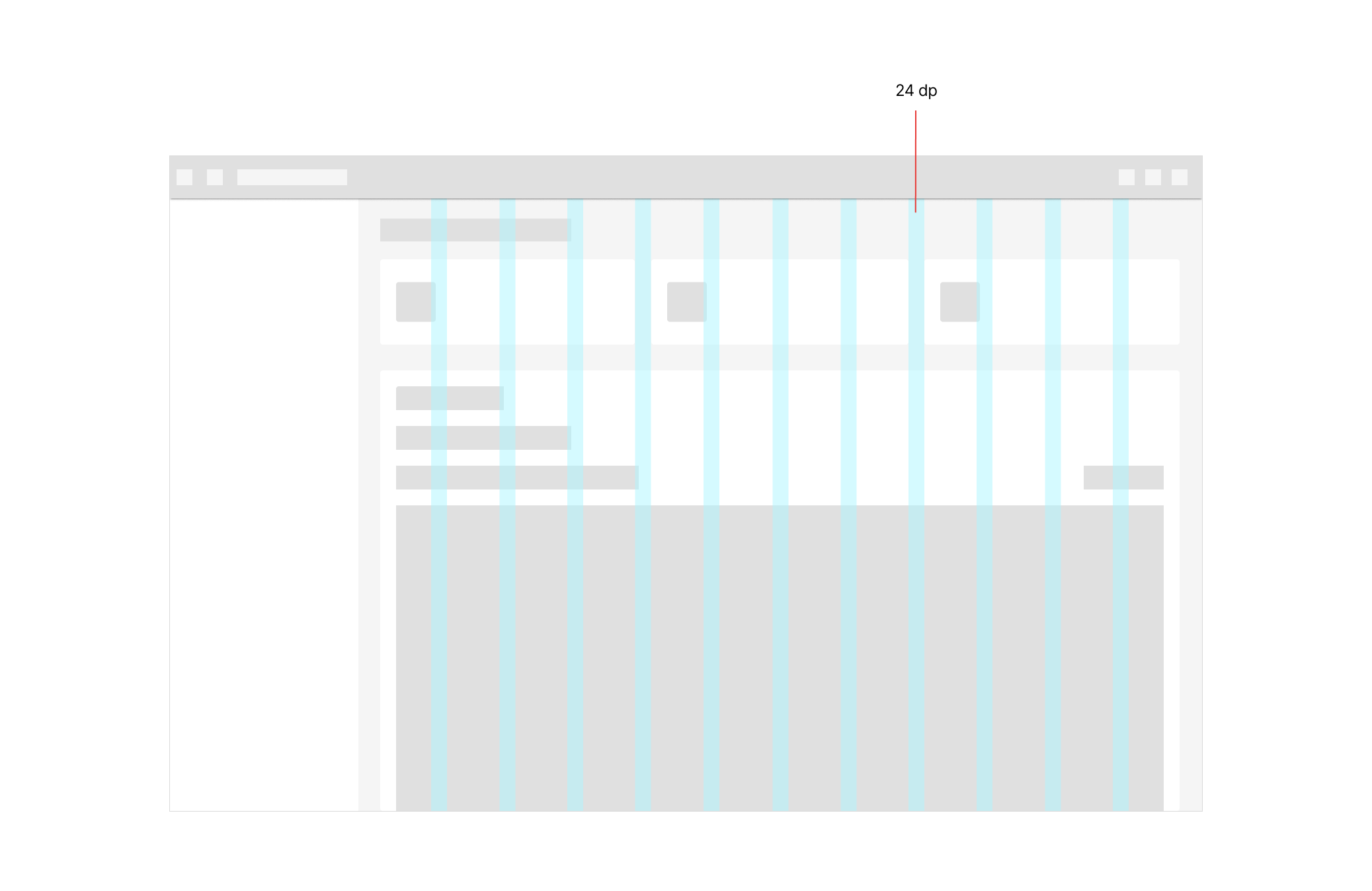
On the other hand, if the content is not extensive or there are not too many elements on the screen, 24dp is recommended. The use of one or the other will depend on each case.
Margins
Margins are the space between content and the left and right edges of the screen.
Margin widths are defined using fixed or scaling values at each breakpoint range. To better adapt to the screen, the margin width CAN change at different breakpoints. Wider margins are more appropriate for larger screens, as they create more whitespace around the perimeter of content.
On mobile, at a breakpoint of 360dp, this layout grid uses 16dp margins

Starting at a breakpoint of 600dp (tablets), the layout grids use 32dp margins

Breakpoint system
A breakpoint is the screen size threshold determined by specific layout requirements. At a given breakpoint range, the layout adjusts to suit the screen size and orientation.
The responsive layout grid is primarily used to organize content and components in a layout’s body region.
When scaling a layout for different screen sizes or orientations, the responsive grid adjusts margin and body widths as well as the number of columns in the layout.
| Screen size | Margin | Body | Columns |
|---|---|---|---|
| Extra-small (phone) | |||
0 - 599dp | 16dp | Fluid | 4 |
| Small (tablet) | |||
600 - 904dp | 32dp | Fluid | 8 |
905 - 1239dp | 32dp | Fluid | 12 |
| Medium - Large (laptop/desktop) | |||
1240dp+ | 32dp | Fluid | 12 |
Behavior
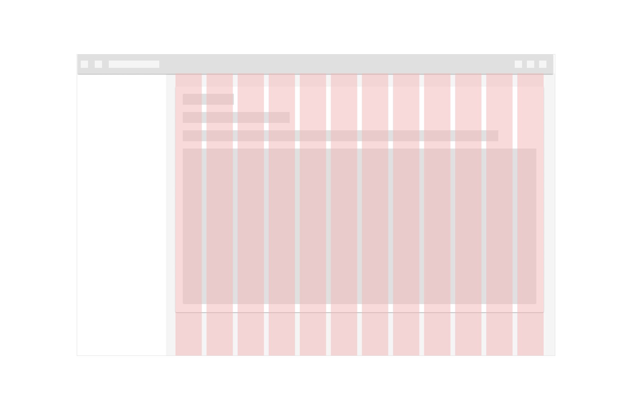
Component adaptation
Component adaptation describes changes in visual presentation (padding, size, layout, or alignment) or switching out one component for another that is better suited to the device size and use case.
Size constraints
Components have minimum and maximum values for container dimensions, margins, and padding.
For example, snackbars have a maximum width of 600dp for large screens. These minimum and maximum values allow for continuous change to the component’s visual presentation as a layout expands from mobile to large screens.
When scaling a layout, components CAN have fixed or responsive widths within the range of size constraints.
Elements with fixed widths remain the same width regardless of a screen’s size
Elements with responsive widths expand and contract as a screen size changes
Don’t use responsive components if the screen is too narrow to display elements and padding at smaller widths.
Use caution when enlarging a responsive component across several columns in a wide screen
Certain components such as buttons CAN become overly emphasized at larger screen widths.