Appearance
Banners
A banner displays a prominent message and related optional actions.

Principles
Appropriately interruptive: Their level of interruption should match the information they contain and the context in which they appear.
Clear: They communicate a succinct message and what will happen if users interact with them.
Focused: These banners contain a single message and specific actions a user can take.
Usage
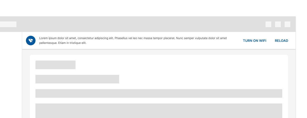
Banners should be displayed at the top of the screen, below the top app-bar. They're persistent and nonmodal, allowing the user to either ignore them or interact with them at any time. Only one banner should be shown
Design guidelines
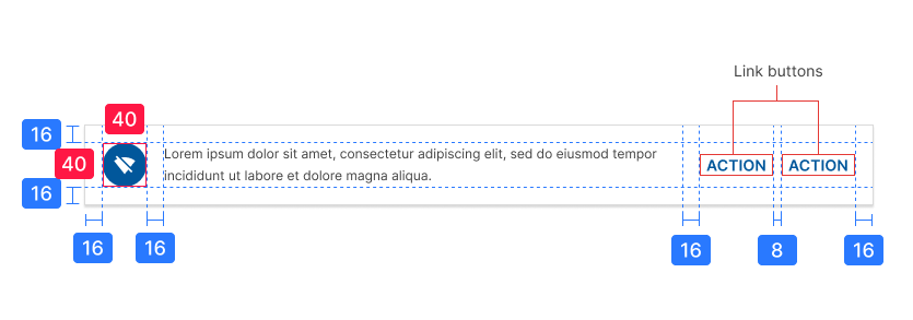
Anatomy
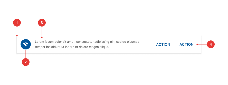
- Container
- Supporting illustration (optional)
- Text
- Action buttons
Container
Banners are rectangular, extending the full width of a layout.
Text
These messages communicate changes or errors within the app.
Action buttons
Buttons in banners should directly relate to a banner’s message and clearly represent the banner’s action. Banners can contain up to two text buttons.
Place buttons under the banner message, or on the same line if there is enough room to fit both.


Placement
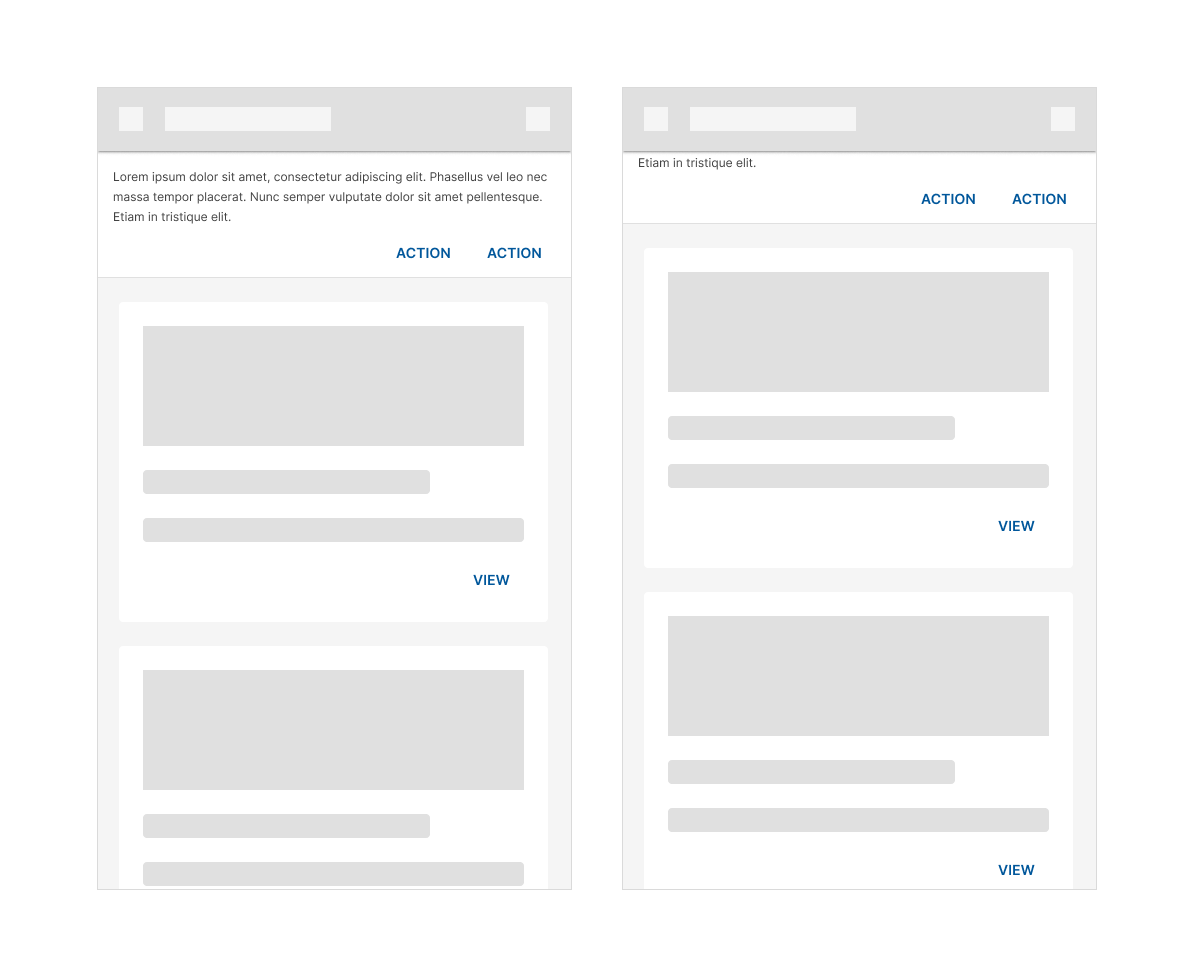
Banners should be placed at the top of a layout or screen. When scrolling, banners typically move with content and scroll off the screen.
On desktop, they remain fixed at the top of the screen, at the same elevation as the top app bar.

On mobile, they scroll off-screen with content, at the same elevation as app content.

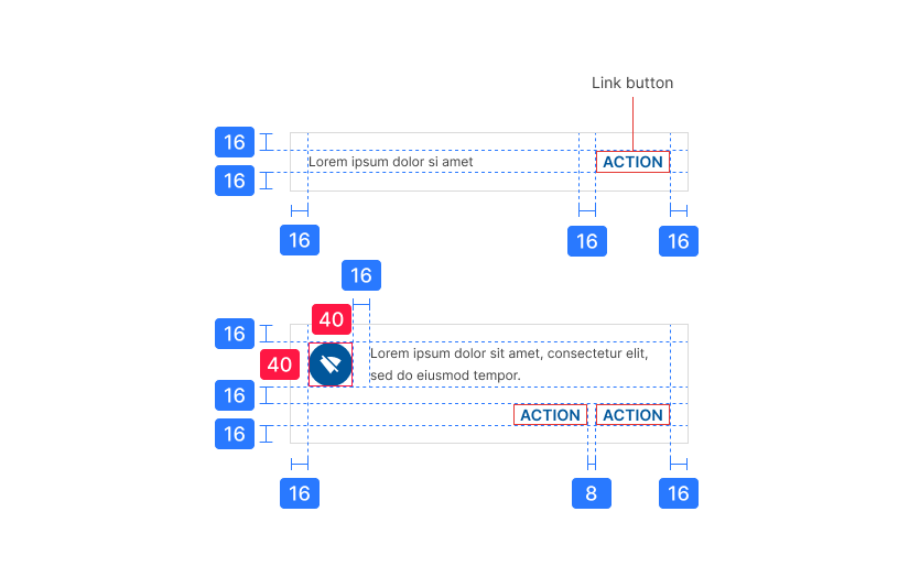
Specs
Desktop banners
Mobile banners