Appearance
Steppers
Steppers convey progress through logical and numbered steps. They may also be used for navigation and may display a transient feedback message after a step is saved.
When to use
Steppers should be used when a field determines a subsequent field. Use steppers to keep the user on track when completing a specific task.
By dividing the end goal into smaller sub-tasks, it increases the percentage of completeness as each task is completed.
Don’t embed steppers within steppers or use multiple steppers on one page.
Don’t used stepper to break up sections in a short form.
Behaviour
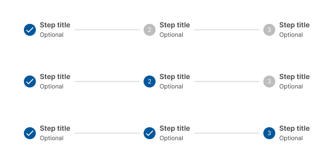
Logical progression
Display the steps in order from left to right. Indicate to the user that they are performing a multistep process, and show the direction of movement. Allow the user to return to a previous step to review their data submission
Indicate the current step
Keeping the user informed of where they currently are within the process or task at hand will give them a sense of control. This helps the user to know where they are in relation to where they have been, and what sections are to follow. Clear labels should accompany the progress indicator to indicate what the user will accomplish within each step. Keep labels between one to two words.
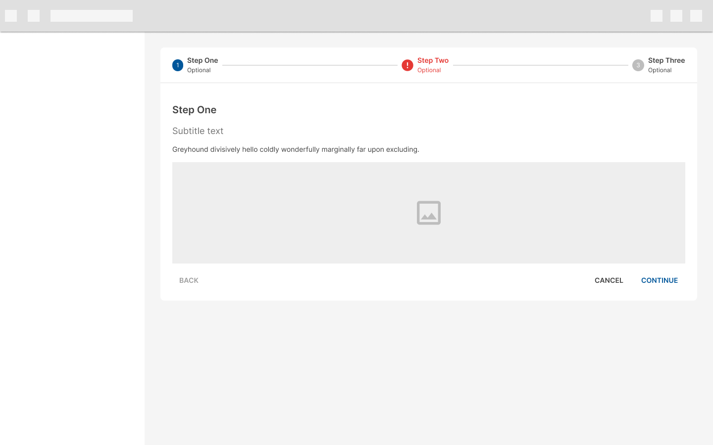
Validation
Use validation to confirm that a previous step has been completed. If the user cannot proceed onto another step without first completing a task, use a Snackbar to inform them.
Types
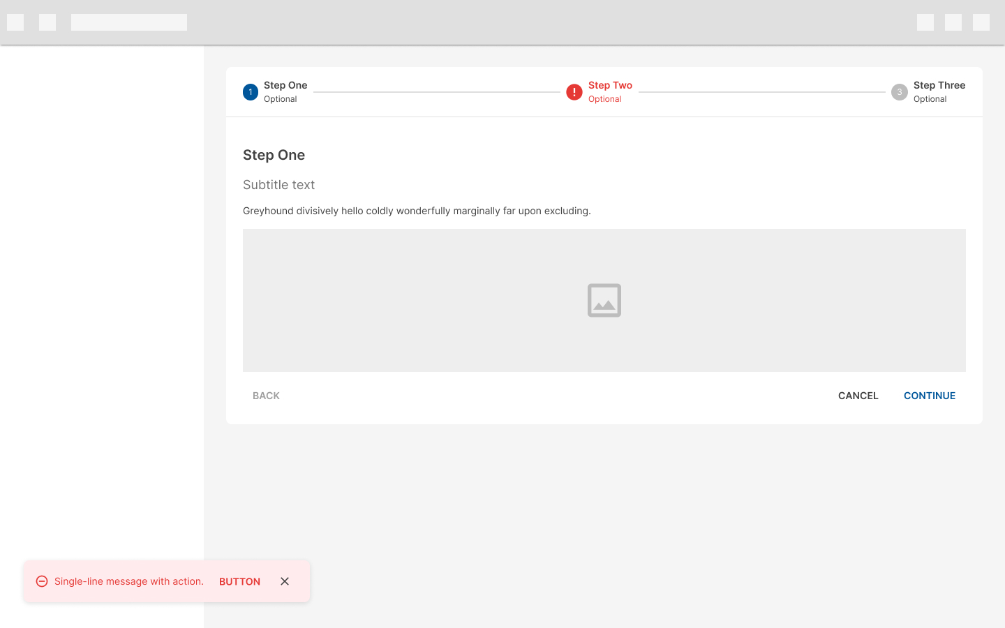
Horizontal steppers
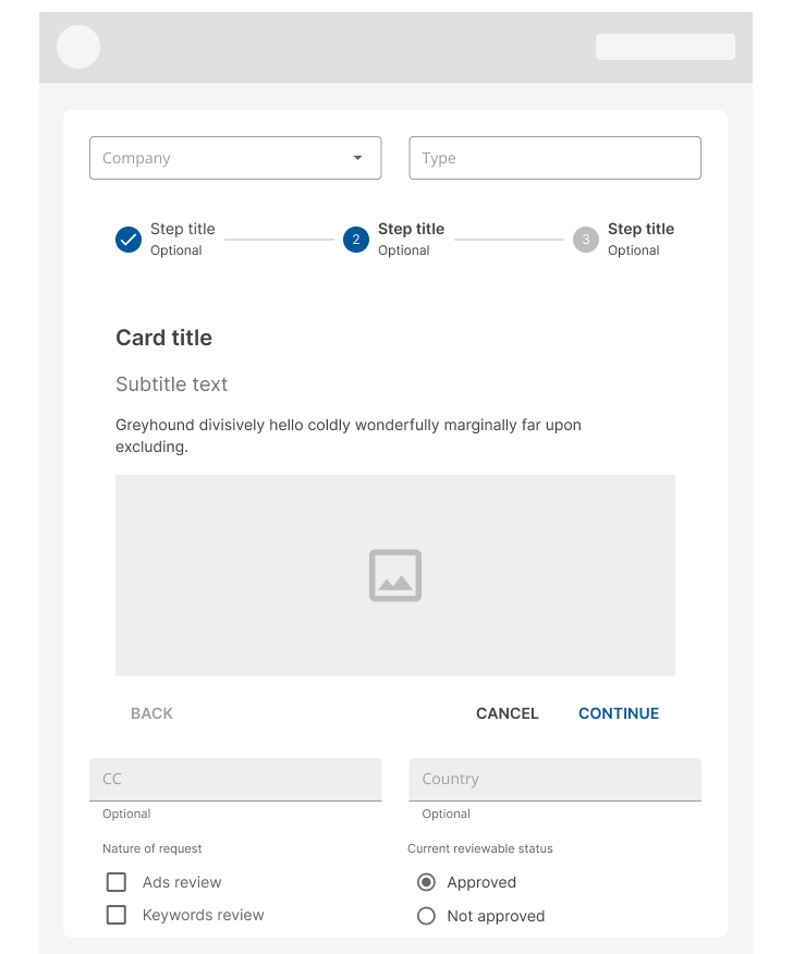
Horizontal steppers are ideal when the contents of one step depend on an earlier step. On horizontal steppers, the step name and numbers appear on a horizontal bar, which can be fixed to the top of the page when scrolling down.
Avoid using long step names in horizontal steppers.
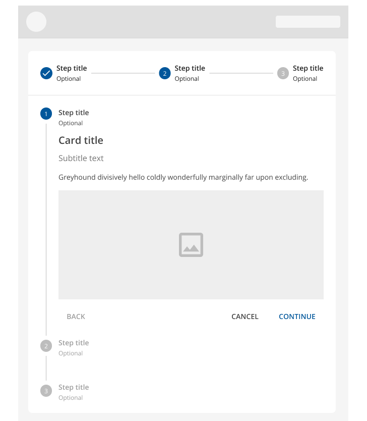
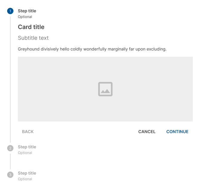
Vertical steppers
Vertical steppers are designed for narrow screen sizes. They are ideal for mobile, simply ensure that the contents for each step are responsive.
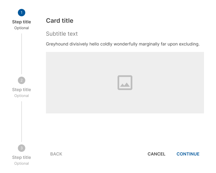
Side steppers
Side steppers are ideal for wide pages where all available space must be used. In side steppers, the step name and numbers appear in a vertical bar fixed to the left of the page. If necessary, only the content of the step can be scrolled down.
Avoid using long step names in side steppers.
Linear steppers
Linear steppers require users to complete one step in order to move on to the next. Each linear step must be completed before proceeding to the next one.

Non-linear steppers
Non-linear steppers allow users to enter a multistep flow at any point. May be completed in any order. Icons can be used instead of numbers to indicate that it's non-linear.

Design Guidelines
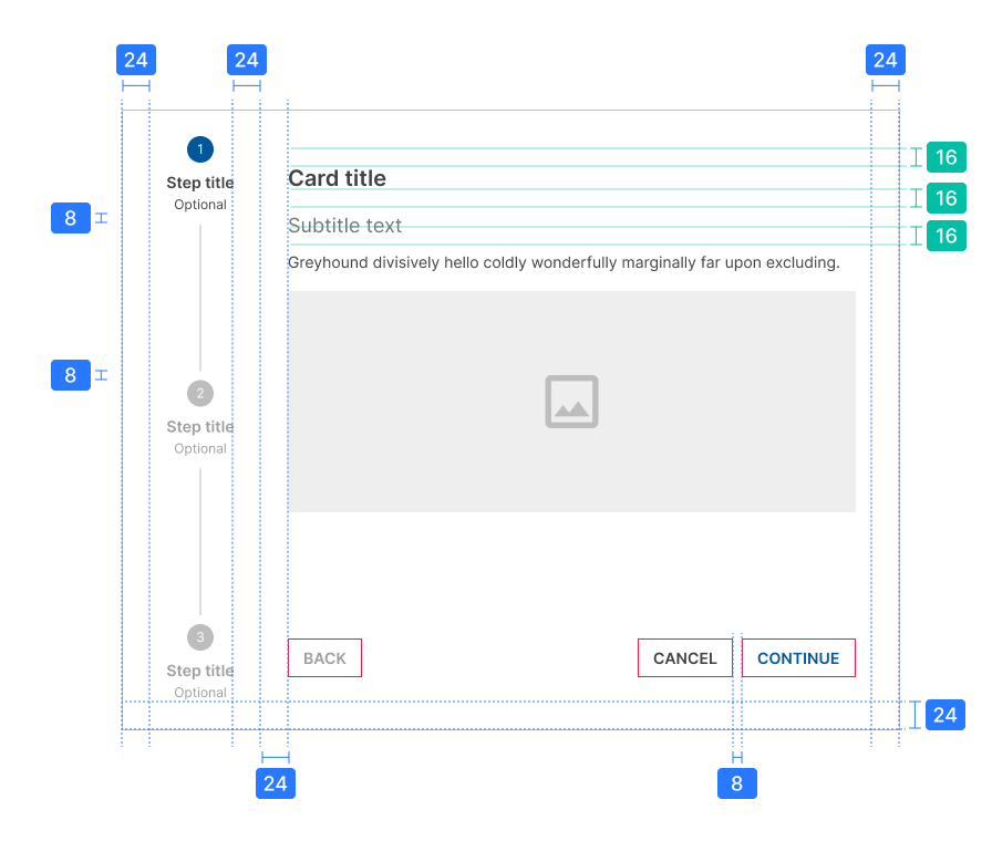
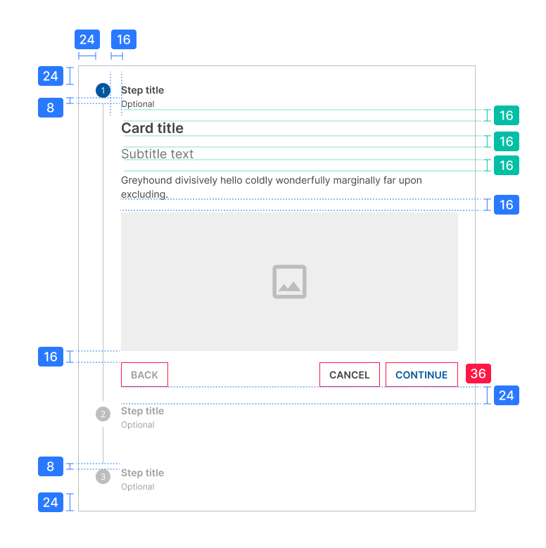
Anatomy
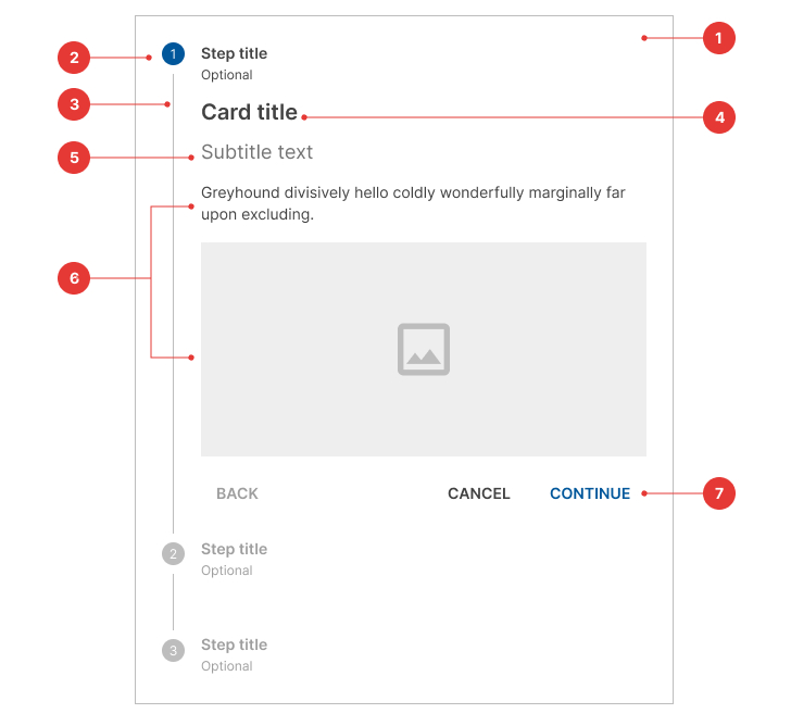
- Container
- Step
- Connector
- Title content
- Subtitle content (optional)
- Content
- Buttons
Steps
Editable steps
Editable steps allow users to return later to edit a step. These are ideal for workflows that involve editing steps within a session.

Non-editable steps
Non-editable steps should be used when:
- Users cannot edit a step later
- Step editing poses a distraction risk to form completion

Optional steps
Optional steps within a linear flow should be marked as optional.
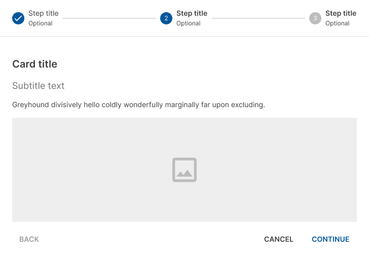
Alternative labels
Alternative label placement like vertical and the same option with an optional step

With an optional step

Mobile steps
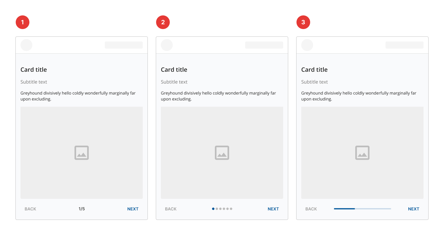
- Mobile step text: Steps displayed at the bottom in text.
- Mobile step dots: Use dots when the number of steps isn’t large.
- Mobile step progress bar: Optional steps within a linear flow should be marked as optional.
States
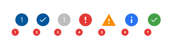
- Default
- Complete
- Inactive
- Error
- Warning
- Info
- Success
Specs
The font size and icon size for stepper elements are summarized as follows:
| Element | Font size (px) | Font weight | Color | Icon size (px) | Background color |
|---|---|---|---|---|---|
| Active Step | 12 | Regular | White | 20 | Primary-900 |
| Inactive Step | 12 | Regular | White | 20 | Neutral-400 |
| Element | Width (px) | Style | Color |
|---|---|---|---|
| Connector | 1 | Solid | Neutral-300 |
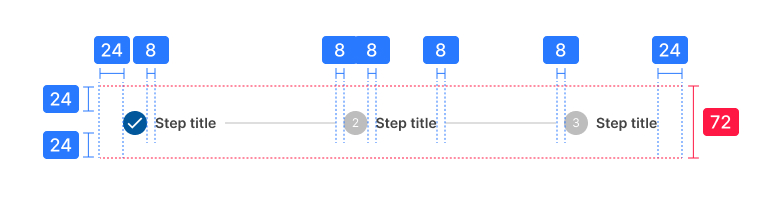
Horizontal stepper
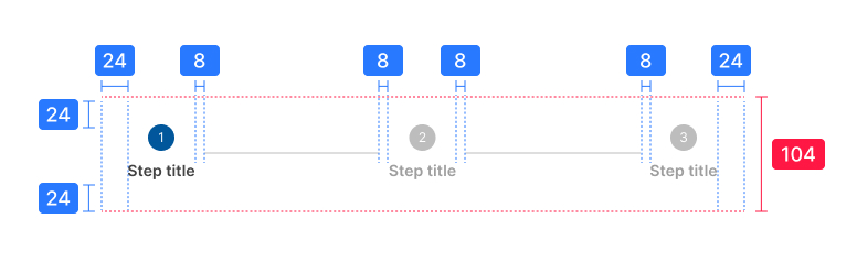
Alternative label
Vertical stepper
Side stepper