Appearance
Data visualization
Data visualization is a form of communication that portrays dense and complex information in graphical form.
The resulting visuals are designed to make it easy to compare data and use it to tell a story – both of which can help users in decision-making.
Principles
Accurate: It allows us to present information in a way that doesn't distort it, prioritizing clarity, integrity and accuracy.
Helpful: Allows us to help users navigate contextual data and affordances that emphasize comparison and exploration.
Scalable: Visualizations are adapted to different devices, anticipating user needs on data depth and complexity.
Types
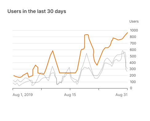
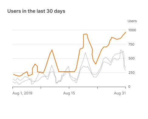
Change over time
These charts show evolving data over time, such as trends or category comparisons.
Some examples for this type are:

Category comparison
These charts are used to compare data between multiple categories.
Some examples for this type are:

Ranking
With these charts, we show an item's position in an ordered list.
Some examples for this type are:

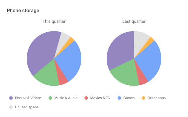
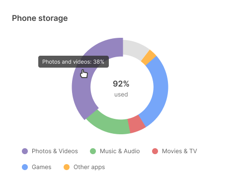
Part-to-whole
These charts show partial elements that add up to a total.

Selecting charts
Showing change over time
| Type of chart | Usage | Baseline value* | Quantity of time series | Data type |
|---|---|---|---|---|
Line chart | To express minor variations in data. | Any value | Any time series (8 or more series) | Continuous |
Bar chart | To express larger variations in data, comparisons, ranking, and how data points relate to a whole. | Zero | 4 or fewer | Discrete or categorical |
* The baseline value is the starting value on the y-axis.
Bar and pie charts
These charts can be used to show proportion.
- Bar charts express quantities through the bar's length, using a common baseline.
- Pie charts express proportion of a whole, using arcs or angles within a circle.
Use bar charts to show changes over time or differences between categories.

Don't use multiple pie charts to show changes over time.
It's difficult to compare the difference in size across each slice of pie.
Style
Data visualizations use custom styles and shapes to make data easier to understand at a glance.
Shape
These bars have subtle rounded corners, ensuring the top of the bar precisely measures the bar's length.

Don't use shapes that make it hard to read the chart, such as bars with imprecise edges.

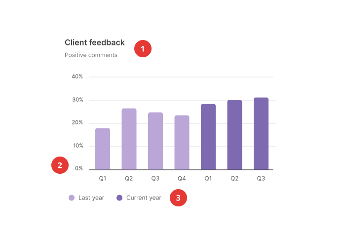
Color
Color can be used to differentiate chart data in four ways:
- Category distinction
- Quantity representation
- Highlighting specific information
- Expressing meaning
Category distinction
Highlighting specific information
Expressing meaning

Lines
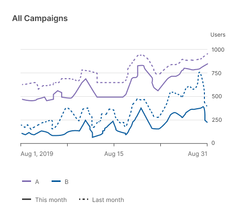
Chart lines can express hierarchy, highlights, and comparisons. Different line styles can be used, such as dashes or varied opacities.
Use other line styles to represent different data types.
Typography
Text can be used to label different chart elements, such as:
- Titles
- Data labels
- Axis labels
- Legend
| Scale category | Typeface | Font | Size |
|---|---|---|---|
1. Chart title | Inter | Semibold | 16px |
Chart subtitle | Inter | Regular | 12px |
2. Axis labels | Inter | Regular | 11px |
3. Legend labels | Inter | Regular | 12px |
Labelled axis
You can remove axes altogether to keep data as the focal point.

In this case, place values directly on their correspondent chart elements.
Axis labels
Don’t overload the chart with numerous axis labels.