Appearance
Menus
Menus display a list of choices on temporary surfaces.
Principles
Nimble: Menus should be easy to open, close, and interact with.
Contextual: Menu content should be suited to users' needs.
Scannable: Menu items should be easy to scan.
Types
Default
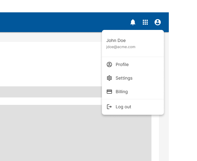
These menus display a list of options, triggered by an icon, button, or action. Their placement varies based on the element that opens them.
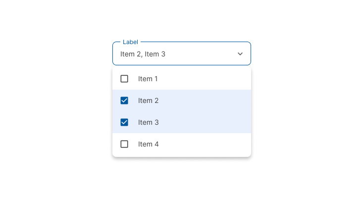
Dropdown
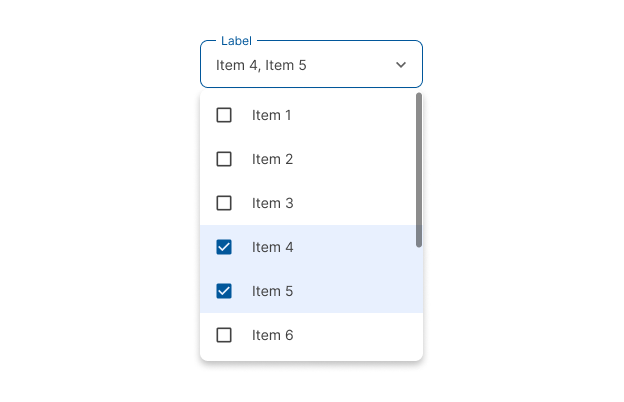
Dropdown menus display a list of selectable options, including the current selected item highlighted. Some variations can accept user-entered input.
Placement
Elevation
Menus appear in front of all other permanent UI elements.
Position
They typically appear below (or in front of) the element that generates them.
If they are in a position to be cut off by the browser or screen’s edge, the menu can instead appear to the left, right, or above the element that generates it.
Design guidelines
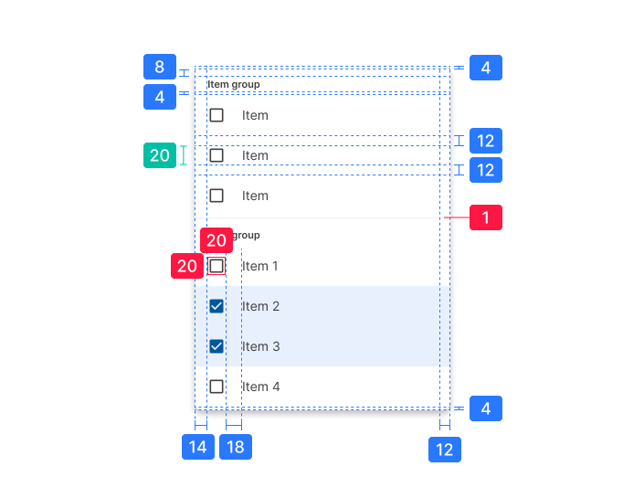
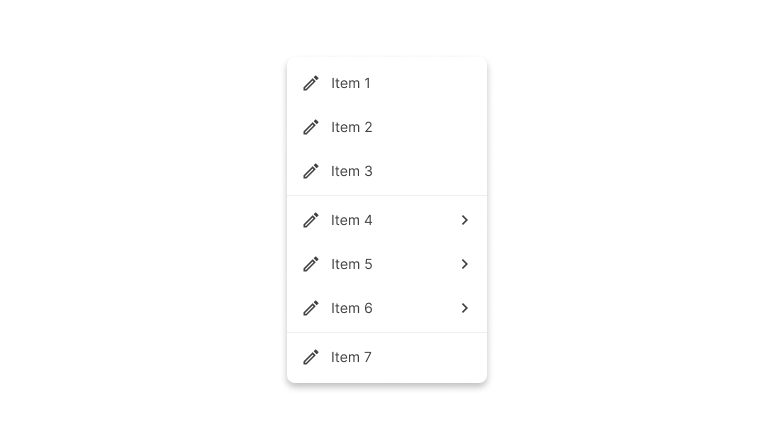
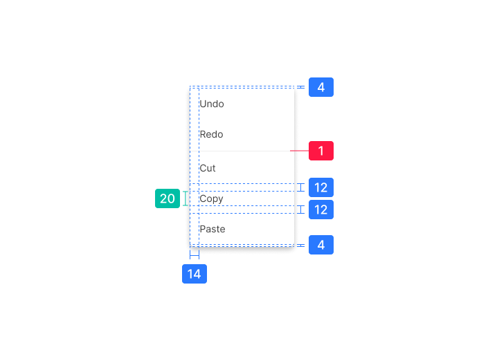
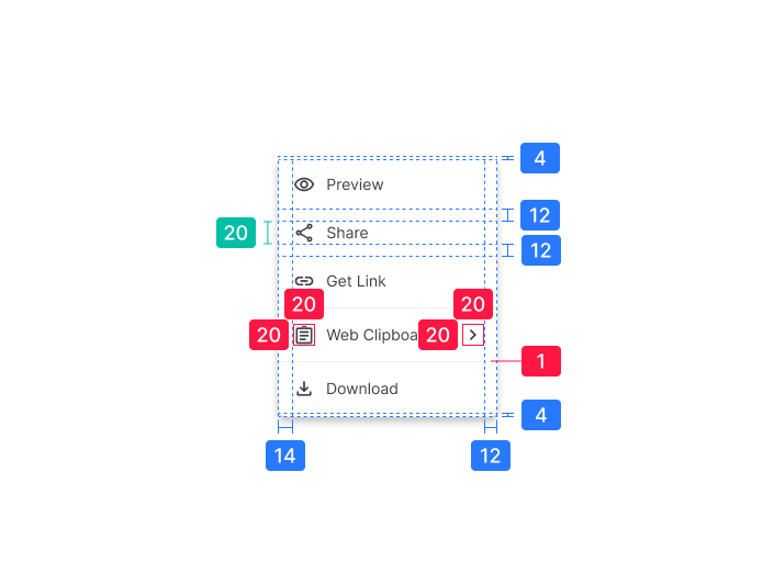
Anatomy
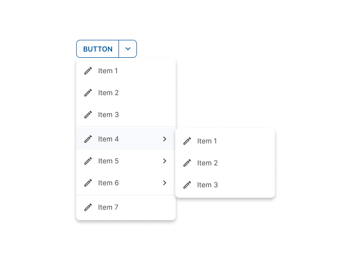
Menus display lists of related options (which can be grouped together) as well as unrelated options. Menus appear when a user taps an interactive UI element such as an icon, button, action, or content, such as selected items or text.
Text list

- Text
- Divider
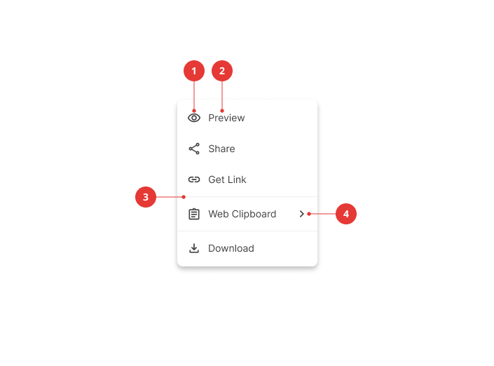
Text icon list
- Icon
- Text
- Divider
- Cascading menu indicator
Selection state list
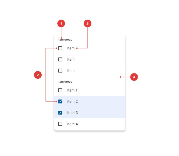
- Group title
- Selection indicator
- Text
- Divider
Behavior
Scrolling
If not all menu items are displayed at once, menus can be scrollable. In this state, menus show a persistent scrollbar.
Specs
Text list
Text icon list
Selection state list