Appearance
Dialogs
They inform users about a task and can contain critical information, require decisions, or involve multiple tasks.

Principles
Focused: They focus user attention to ensure their content is addressed.
Direct: Dialogs should be direct in communicating information and dedicated to completing a task.
Helpful: They should appear in response to a user task or an action, with relevant or contextual information.
When to use
They have the highest priority in contrast to banners and snackbars.
Dialogs should be used when you need to block the user's app usage until they take a dialog action or exit the dialog.
Types
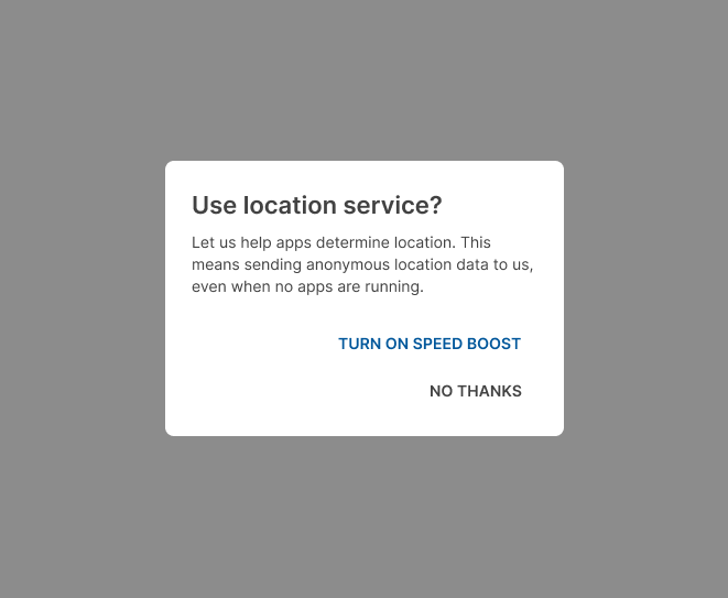
Alert
These types of dialogs interrupt users with urgent information, details or actions.

Simple
Simple dialogs display elements that take immediate effect when selected.
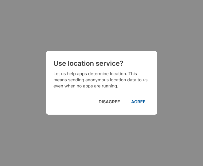
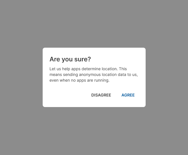
Confirmation
These dialogs require users to confirm a choice before the dialog is dismissed.

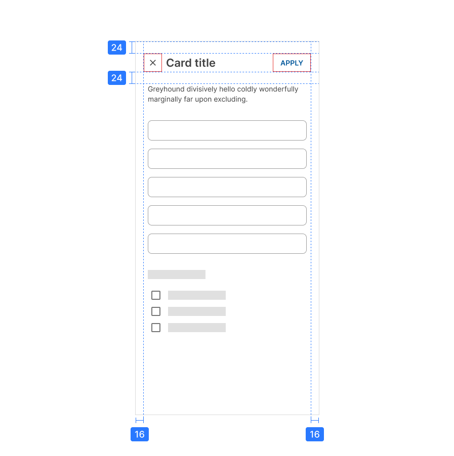
Full-screen
Full-screen dialogs are only for mobile devices. Modal dialogs MUST be used for desktop and tablets.
These dialogs include components which require keyboard input, such as form fields.

Design guidelines
Anatomy
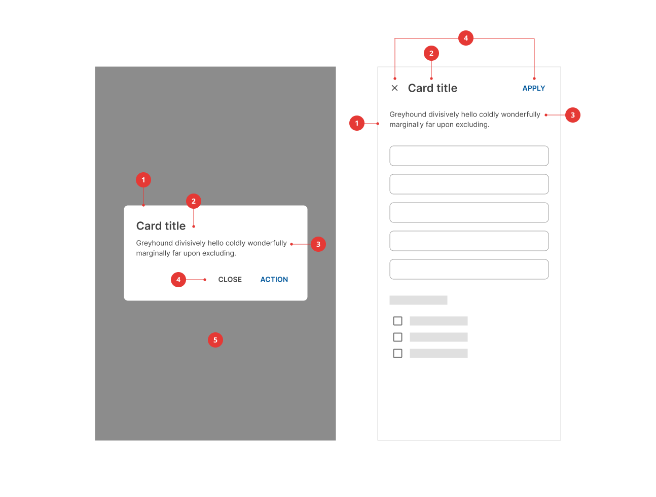
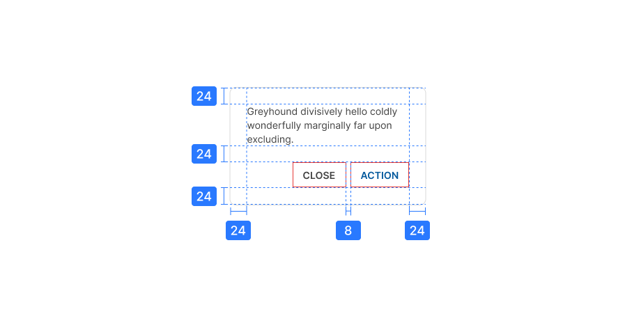
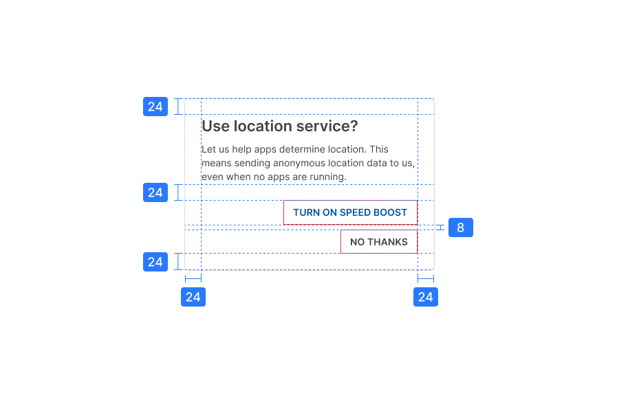
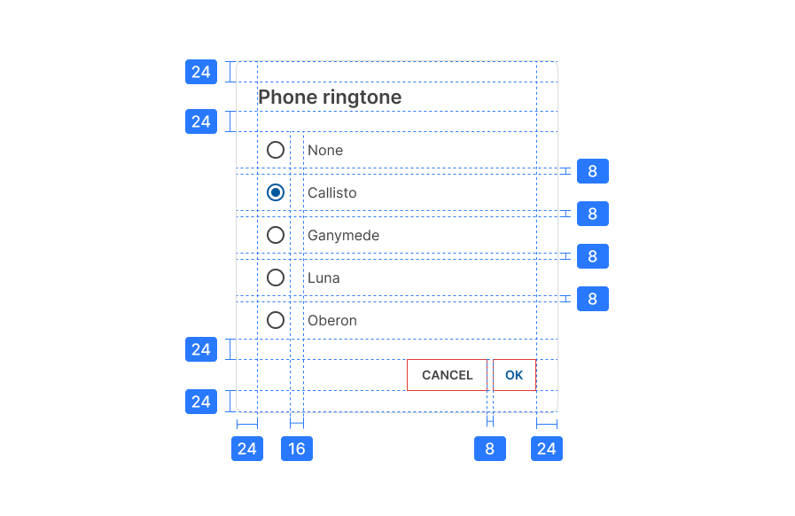
- Container
- Title (optional)
- Supporting text
- Action buttons
- Scrim (only for modal dialogs)
Title
The dialog's purpose should be communicated by its title and button text.
Titles should contain a clear statement or a question.
Avoid apologies, alarm or ambiguity.
Action buttons
Side-by-side buttons.
Dismissive actions are placed to the left of confirming options.
Stacked full-width buttons accommodate longer text.
Confirming actions appear above dismissive actions.
Specs