Appearance
Tooltips
Tooltips display informative text when users hover over, focus on, or tap an element. They add additional context to any UI element.
Principles
Transient: They appear on hover, focus, or touch, and disappear after a short duration.
Paired: Tooltips are always paired near the element with which they are associated.
Succinct: They include descriptive text related to their associated element.
Use cases
When activated, tooltips display a text label identifying an element, such as a description of its function.
Tooltips are recommended when:
- Labeling UI elements with no text, like icon-only buttons and fields.
- Introducing new features in walkthroughes or onboardings.
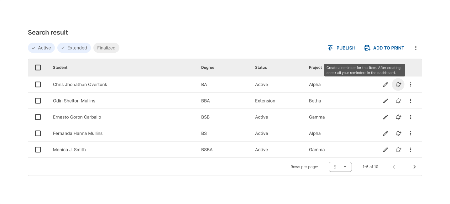
Plain tooltips
Use plain tooltips for icons or actions that don’t have a label.

Tooltips are user-triggered and will not appear unless users interact with the elements that they are attached to.
Don’t use tooltips to restate visible UI text.

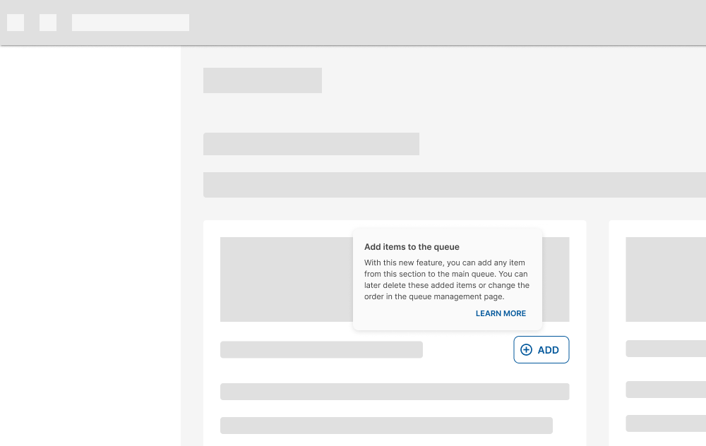
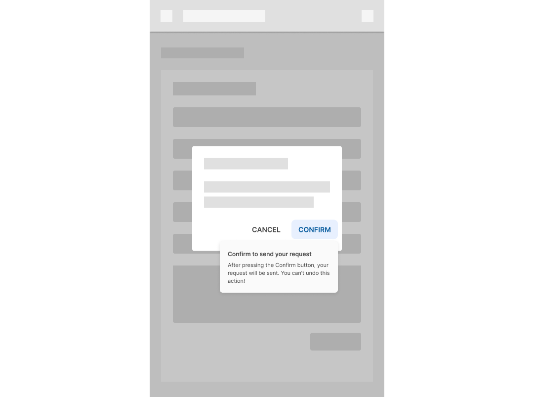
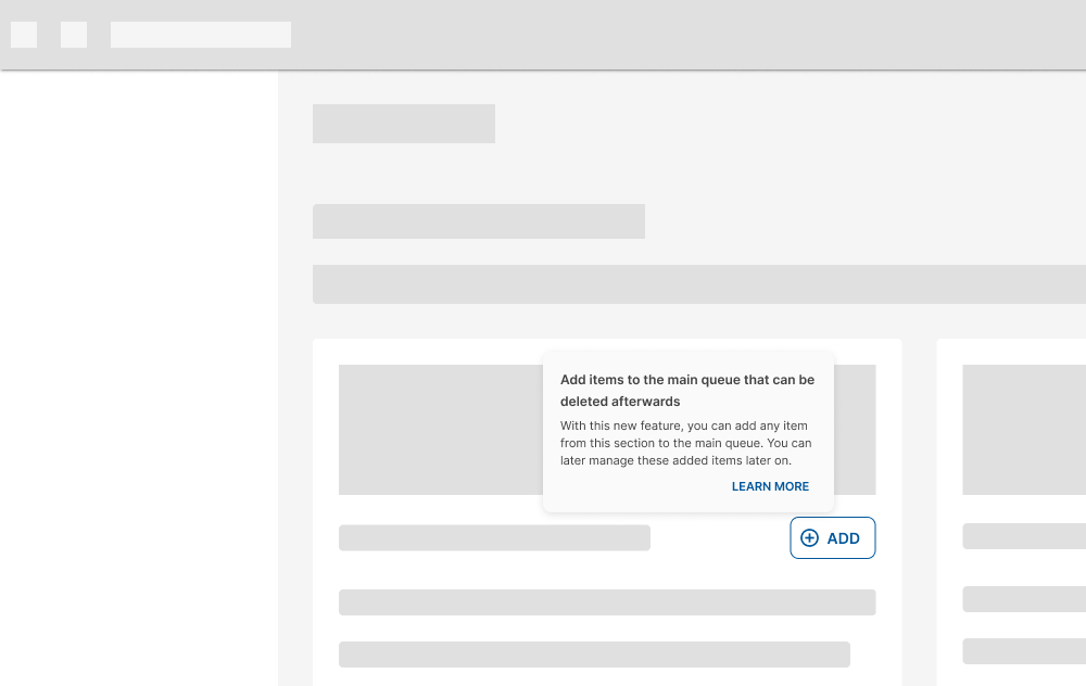
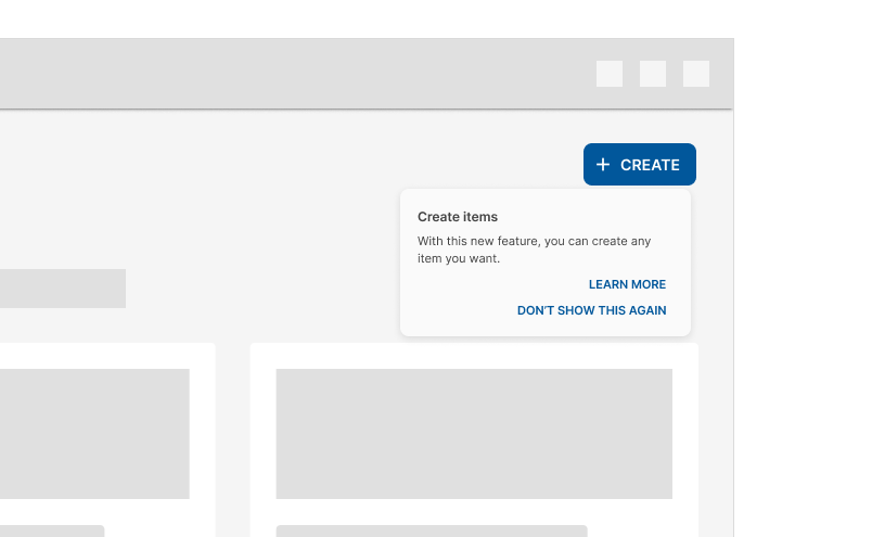
Rich tooltips
These tooltips provide additional context about a UI element. They can optionally contain a subhead, buttons, and hyperlinks.
Rich tooltips are best used for longer text like definitions or explanations.
Avoid placing any information in the tooltips that are vital to the task flow.
Design guidelines
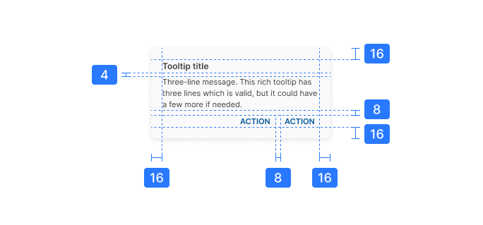
Anatomy
- Title (optional)
- Supporting text
- Actions (optional)
- Container
Title
Titles are important to include when the rich tooltip appears automatically, like when the page loads.
Keep titles brief, ideally to one line. They should summarize or describe the message of the rich tooltip.
Titles MUST NOT have more than one line of text.
Supportive text
Bear in mind that plain tooltips MUST be used if the message is short.
Supportive text that has more than one line of text MUST NOT be embedded in a plain tooltip.
For a supportive text that has more than one short sentence or that needs more context, rich tooltips MUST be used.
Actions
Rich tooltips can have up to two actions. These actions should be brief and relevant to the message in the supporting text.
DO NOT stack actions inside a tooltip.
Keep actions short so they can be side by side.
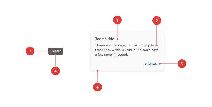
Placement
By default, plain tooltips are positioned directly above the parent element.
If the element is in a top app bar, the plain tooltip appears below the element at the same distances.

Rich tooltips are positioned by default to the bottom right of the parent element.
Tooltips MUST NOT go off screen.

Tooltips shouldn't cover the parent element.

Behavior
To show a tooltip, hover on the parent element on desktop, or tap and hold the element on mobile. Persistent rich tooltips only appear when clicked or tapped.
Both plain and rich tooltips disappear 1.5 seconds after navigating away from the target region. Also, triggering a new tooltip immediately closes any other open tooltip.
DO NOT display more than one tooltip at a time.
Specs
Plain tooltip

Rich tooltip