Appearance
System Icons
Icons are visual representations of ideas, objects or actions. They communicate messages at a glance, afford interactivity, and draw attention to important information.
System icons symbolize an action or a specific entity with meaning for the user.
Overview

For system icons we use Material Symbols.
Material Symbols
Created by the Google team, this library is designed to be simple, modern and user-friendly. In order to maintain consistency and to ensure ease of use, Material icons have been defined as the main icon library in our design system.
You should use this library for the system icons in your application.
How to use
For system icons we mainly use the outlined-rounded style.
In some cases you can combine styles like outlined and filled, but you must be cautious. Don't mix styles just for aesthetic reasons; any combination should respond to a just cause.
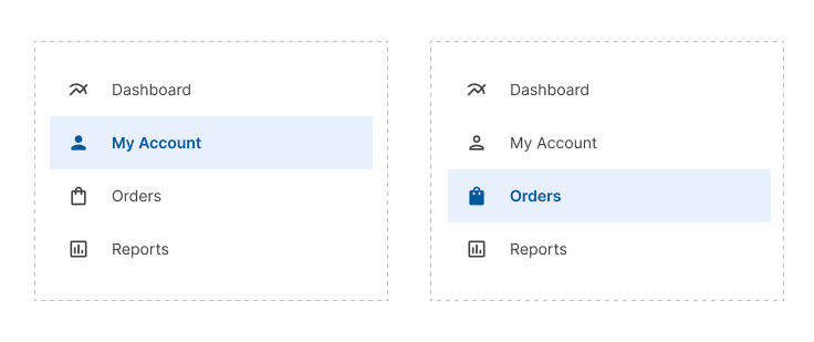
You can use a combination of styles to alert the user that an element is selected.
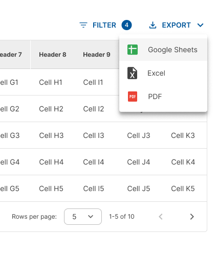
You may use colored icons to represent a brand, an external software or a country's flag.
For example, to represent documents such as Word, Excel, PDF, Adobe, etc, you can use colored icons. Just be careful not to mix them within the same section with icons of another style.
You can use colored icons to represent external software.
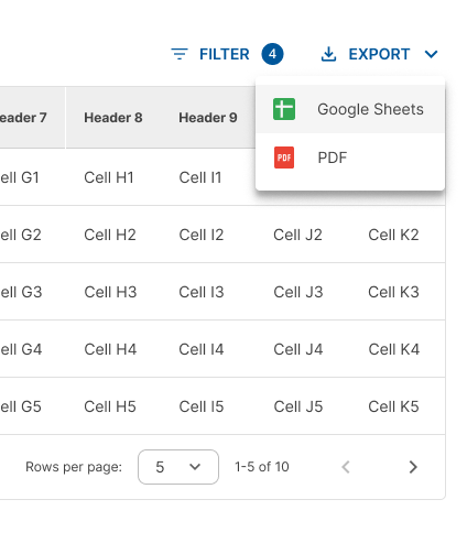
Do not mix black/white and colored icons in the same section.
Design Guidelines
Sizing
Our custom design system uses 20 x 20 dp icons.
Make sure that the icon size is 20 dp because most libraries using Material design work with an icon size of 24 dp. But this is not suitable for our applications.
Icon sizes

Touch target
Adequate space should surround system icons to allow legibility and clicking area.
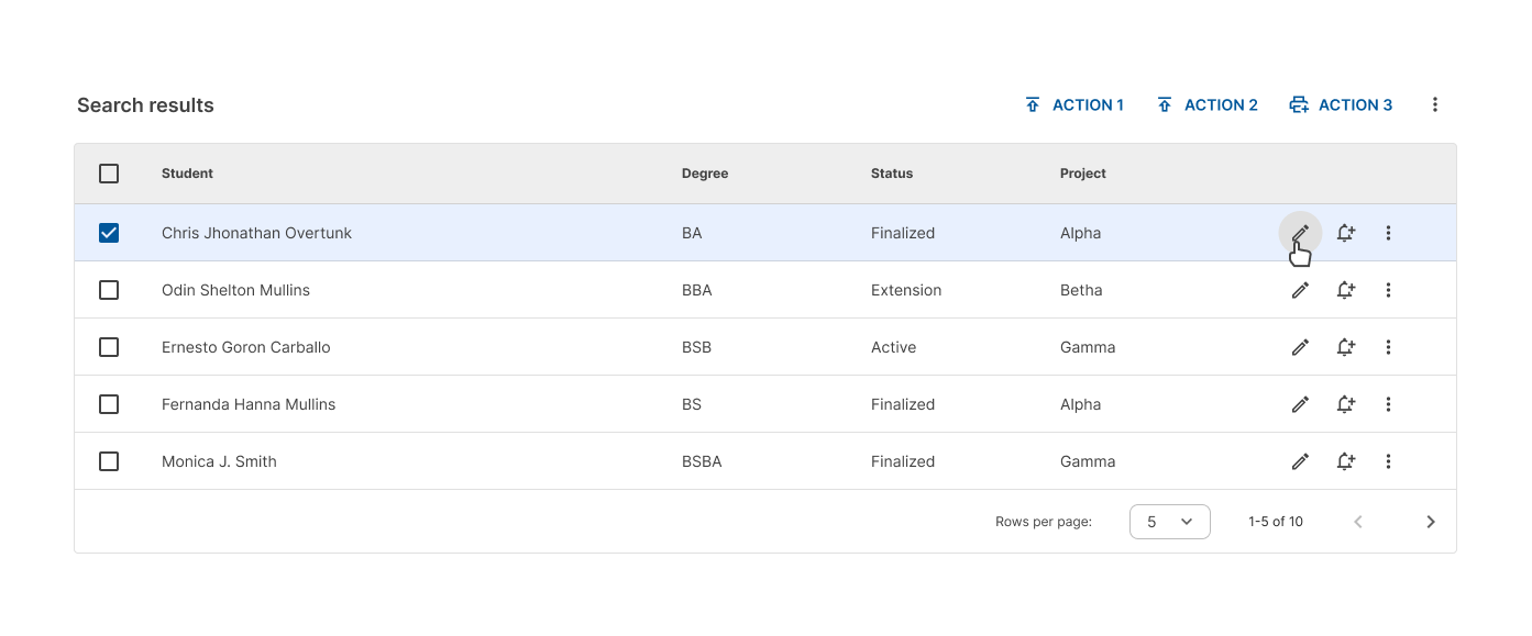
All touch targets for interactive icons need to be 40 dp.

In tables, do not leave padding between row actions, just leave the touch target for separation.
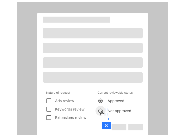
Set a touch target of 40 dp for checkboxes.

Leave 8 dp of padding between the control and the label.
Alignment
When used next to text, icons should be center-aligned.
Do center-align icons when they’re next to text.

Don’t baseline-align icons to the text.

Icon styles
Important
The use of the outlined style without filler has been defined as the main style.
You should be sure to use the outlined style in the design of your interfaces. However, you can use filled icons in certain cases where the default style is not suitable for the interpretation of the icon or you need to indicate that an action has been performed on that icon.

Resources
- To see or download the Material Icons please refer to the link: https://fonts.google.com/icons
- In Figma you can add the Material Symbols plugin to your design file: https://www.figma.com/community/plugin/1088610476491668236/material-symbols