Appearance
Tables
Tables display information in a grid-like format of rows and columns. They organize information in a way that’s easy to scan so that users can look for patterns and develop insights from data.
Principles
Organized: Information should be organized in a meaningful way, such as hierarchy or alphabetization.
Interactive: Tables should allow user interaction so that a data display is customizable and interactive.
Intuitive: Tables should be easy to use, with a logical structure that makes content easy to understand.
When to use
Tables are recommended when:
- Users want to look up specific information or find records that fit specific criteria.
- There is data comparison and precise numbers are important.
- An action needs to be taken on one or multiple records.
Types
There are two types of tables:
- Compact (default)
- Comfortable
Compact
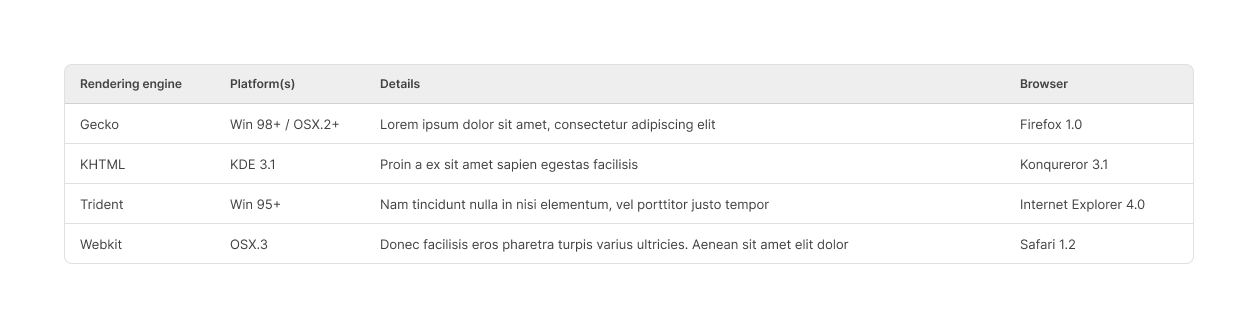
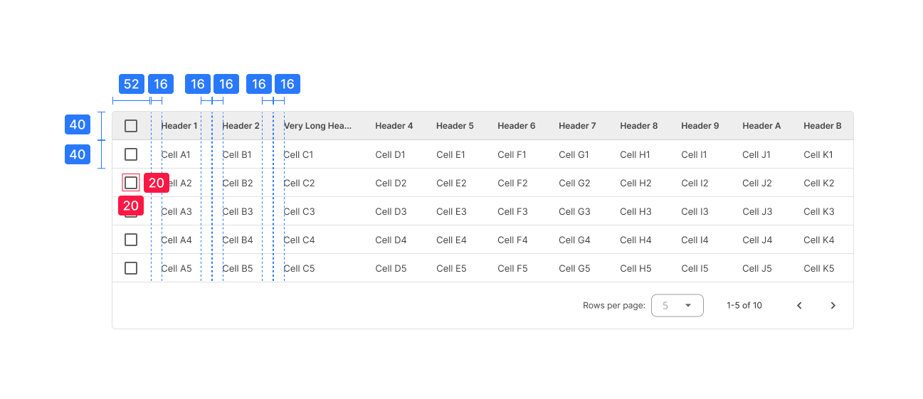
Compact tables SHOULD be used by default. With these tables, space is optimized and more results can be displayed on the screen.
This type of tables MUST be used in case they’re located inside another table’s child row.
Comfortable
These tables are a valid option in cases where there are not many results (rows) or there are multiple actions per row that would make the contents of compact tables look too cramped.

The use of the comfortable mode must be validated beforehand.
Design guidelines
Tables CAN contain:
- Interactive components (such as chips, buttons or menus).
- Non-interactive elements (such as badges).
- Tools to query and manipulate data.
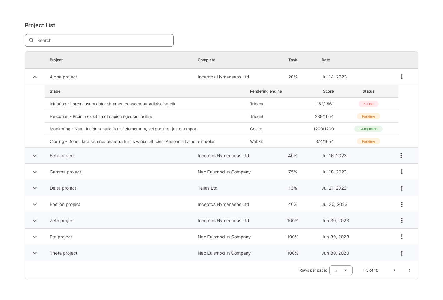
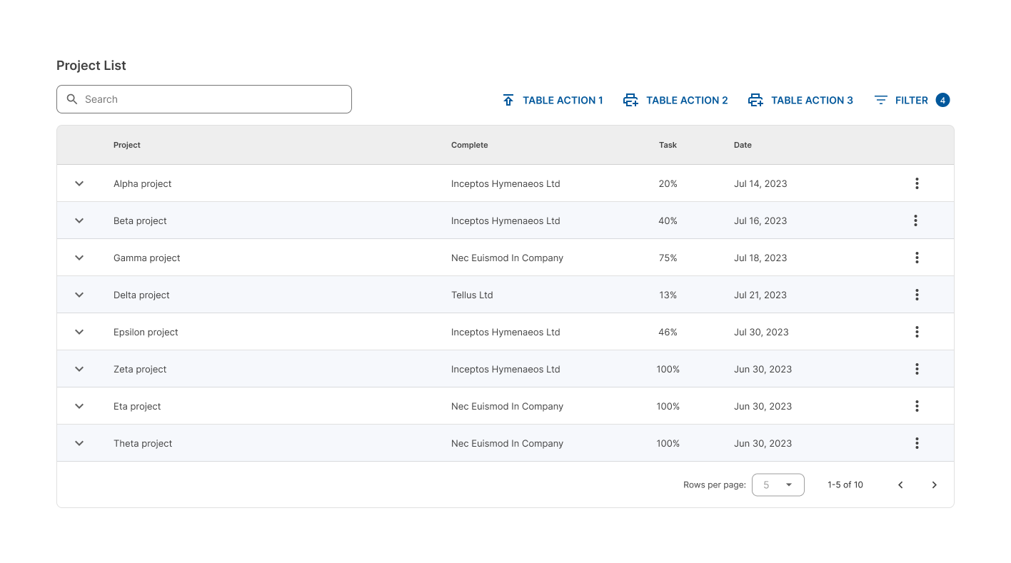
Anatomy
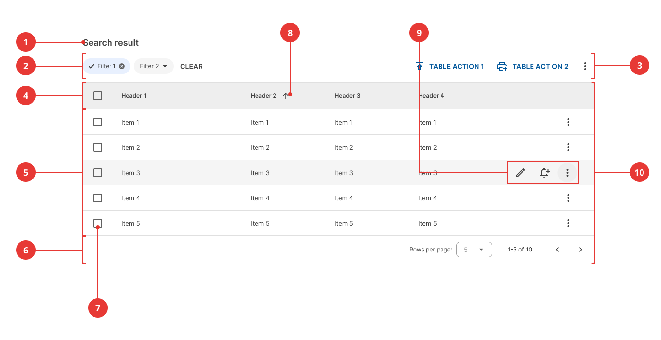
- Title (optional)
- Filters (optional)
- Table actions (optional)
- Header row
- Rows
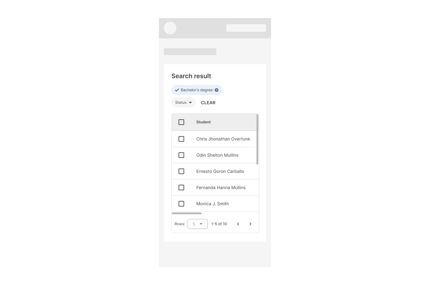
- Pagination
- Row checkbox (optional)
- Sort buttons
- Row actions
- Container
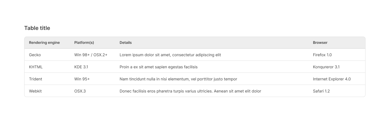
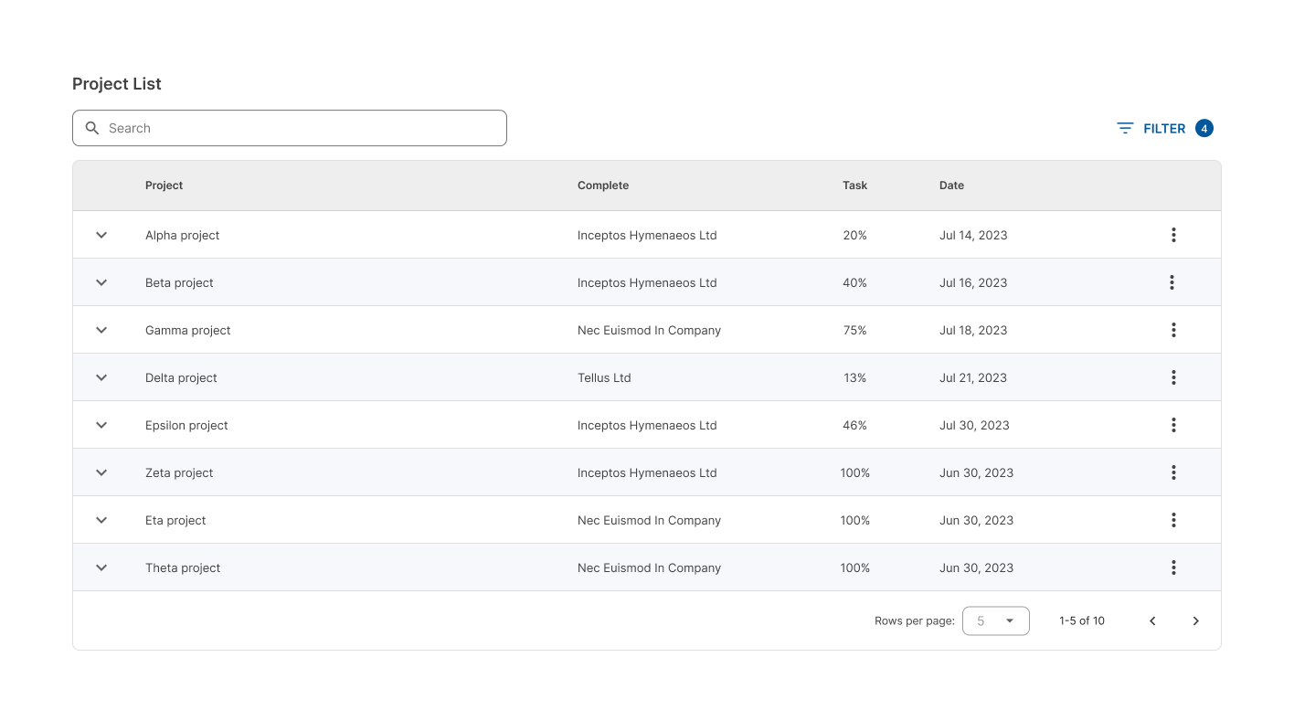
Title
It is not mandatory to have it, especially for simple tables that only show a limited number of rows and static data.
If no filters or batch actions are needed, the entire toolbar is omitted and only the title remains.
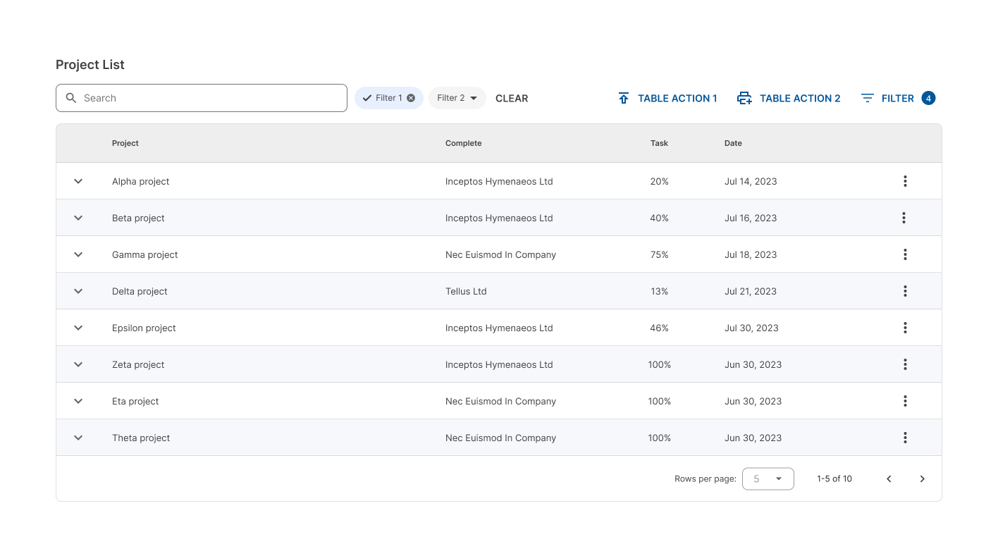
Filters
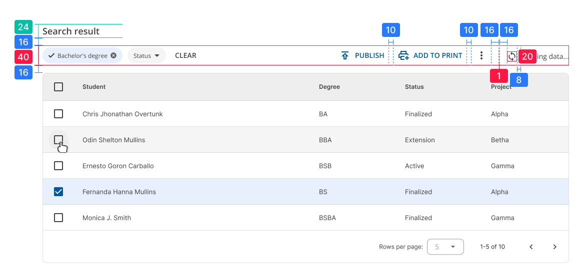
Users could filter the results within a table in different ways: by typing the value in an input (search) or by selecting among several filters that match some of the rows.
For the first case, the search input is placed in the table header, below the title.
In case specific filters are needed, they are placed below the title as well, just like the input. They are displayed as interactive chips.
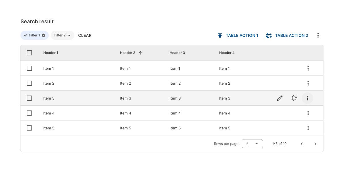
It could be the case that we need a mix of both, and we need to use a search input in addition to some filters.
The input is placed below the title and the filter action is placed next to the rest of the batch actions on the right side of the toolbar. In this case, the filter action always goes to the far right.
 The filters are displayed in a drawer that slides from the right side of the screen.
Do not use all the filtering options at once in the same table toolbar.
 This can cause a visual overload and distract or confuse users with too many buttons and actions to filter the data.
Table actions
When you need to perform actions that affect the entire table or selected rows in it, batch actions are used. These are located on the right side of the toolbar.
They can include simple actions with icon and text, actions with context menu, and other secondary actions that MUST be located in the context menu that opens from the ellipsis icon.
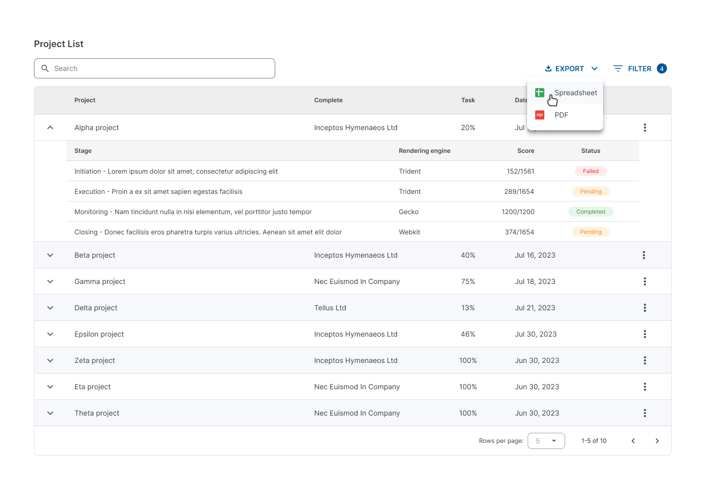
Within the batch actions section of the toolbar there CAN be a maximum of 3 main actions.
When there are more than 3, the rest MUST be placed inside the contextual menu of the ellipsis icon.
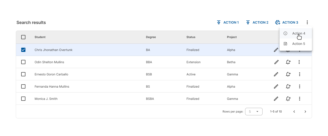
Avoid showing more than 3 main actions for the table.
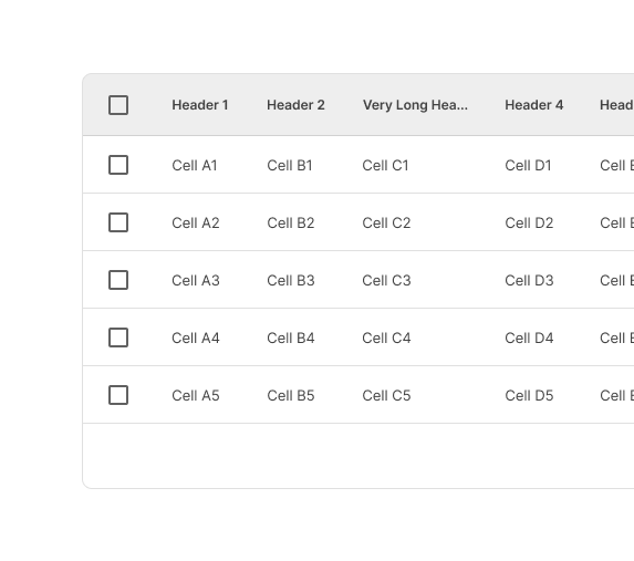
Header row
Contains header names that describe the type of content displayed in each column.
Text that is longer than the column width is truncated with an ellipsis.
Rows
Striped rows can also be used in certain circumstances. A different background color MUST be used for each even row.
Row checkbox
When a row checkbox is selected, the row MUST display a different background color.
The addition of a background color fill provides an additional way to indicate that a row has been selected.

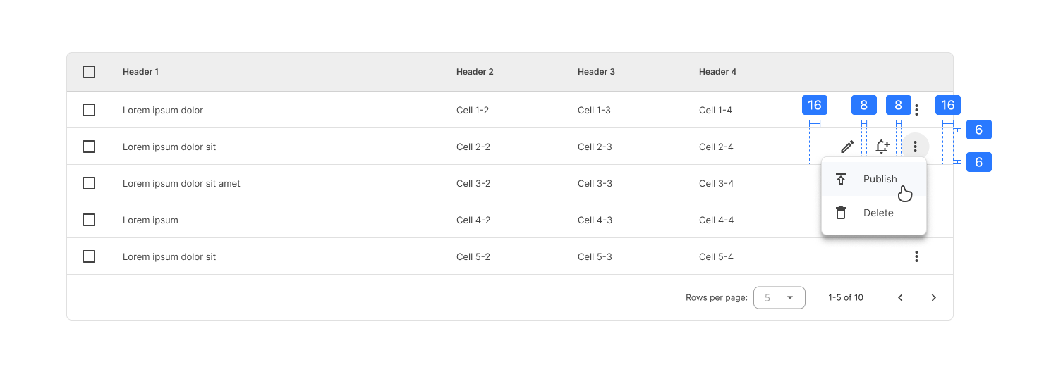
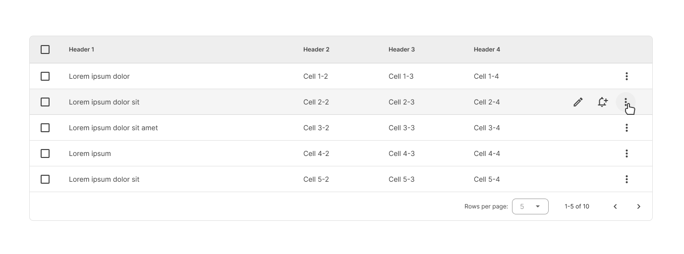
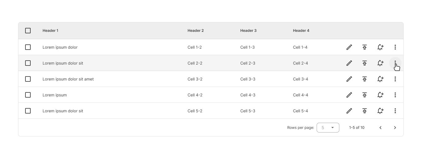
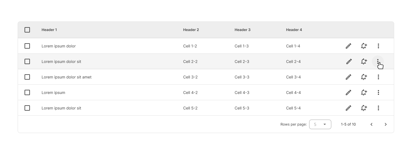
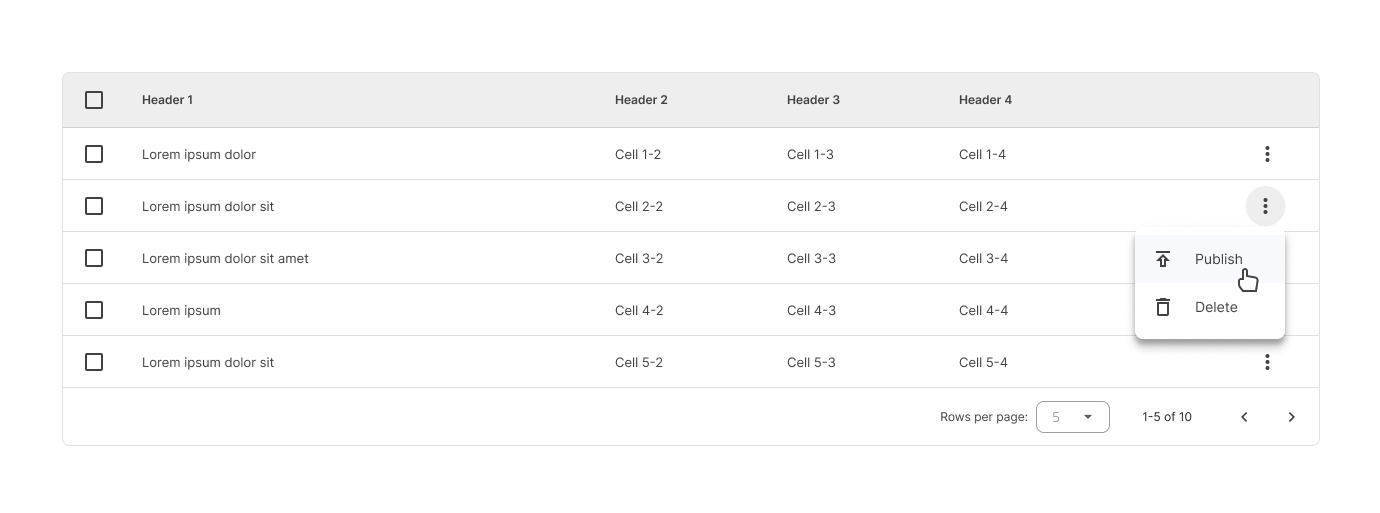
Row actions
A maximum of 3 actions per row are allowed. Generally there are 2 icons for the most important and/or most common (primary) actions, and a vertical ellipsis icon that displays a context menu for the other secondary actions.
- If there are 3 actions per row, then they can all be displayed in line.
- If there are 4 or more actions per row, then the 2 primary actions are displayed and the others must be displayed within the context menu.
By default, all the row action icons are shown.
Do not show more than 3 main actions for each row.
 It gets more difficult for users to focus on the most important tasks if all the available actions are displayed at once.
These actions can also appear when a user hovers over a row. These icons are hidden, except for the vertical ellipsis icon (used to indicate that something can be done in a specific row).
Behavior
Hover
Rows
When a user hovers over a row, that row displays a different background color.

Headers
When the user hovers over a column header:
A tooltip CAN display the full column name (if it’s truncated) or a more detailed description of the column.
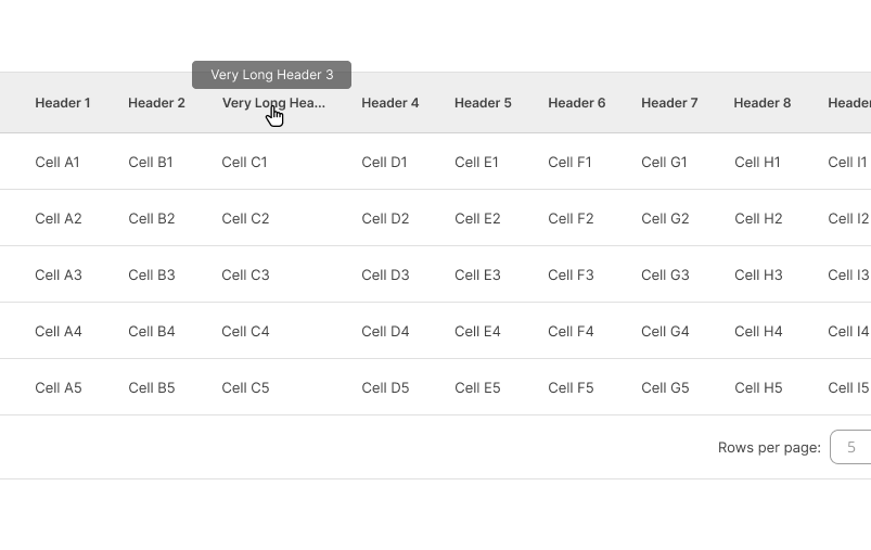
If sorting is enabled, an arrow icon CAN appear next to the column header.

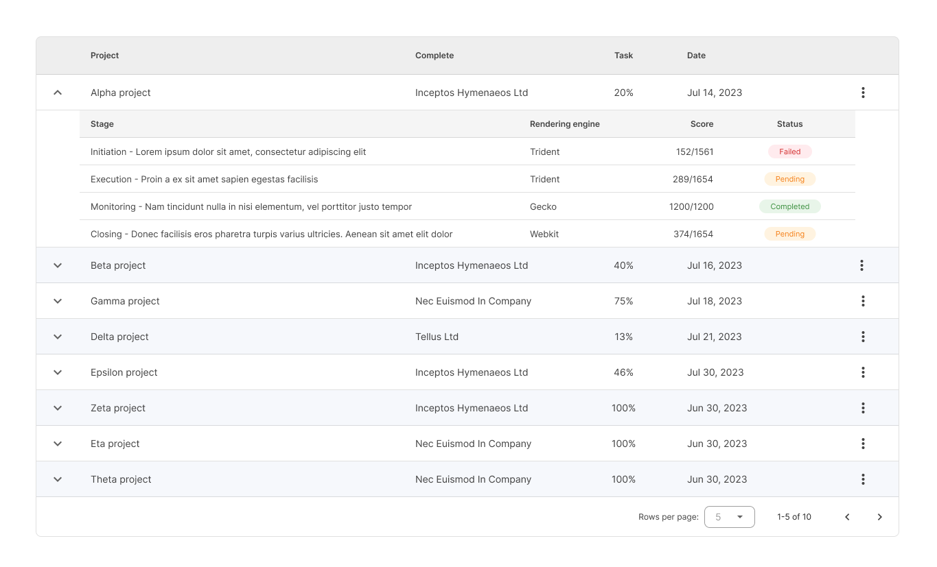
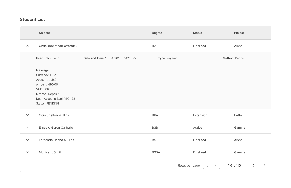
Expand / Collapse
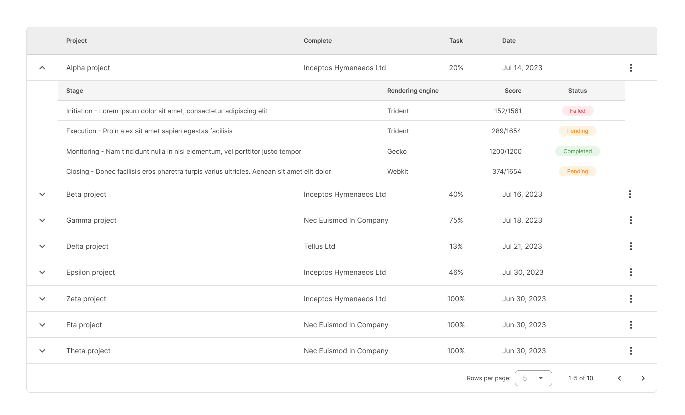
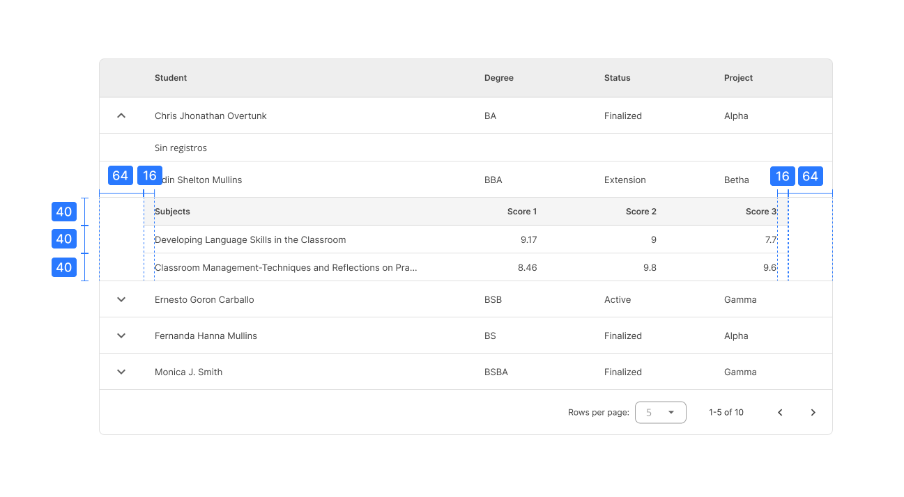
Child rows
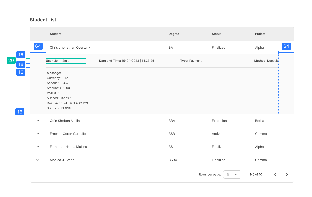
A column MAY have additional information that CAN be displayed as an expanded child row.
This child row CAN contain plain text or even another table within.
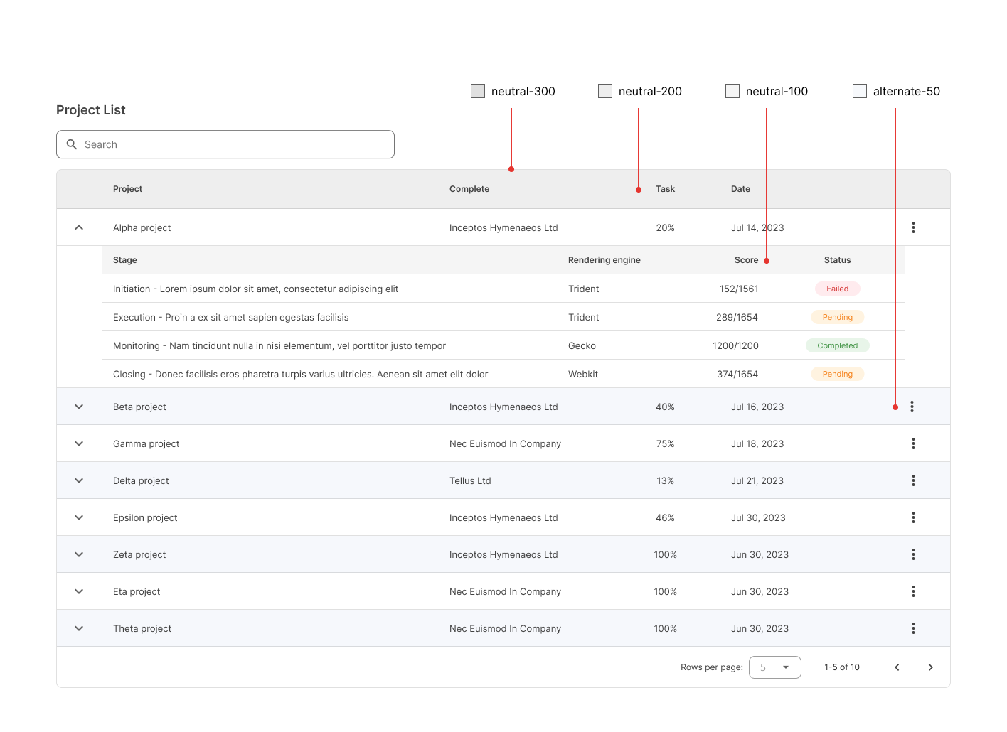
Whenever a table is inside a child row, it MUST be presented in compact mode (headers and rows are 40px high). In addition to this, a child row has left and right margins of 64px relative to the parent row.
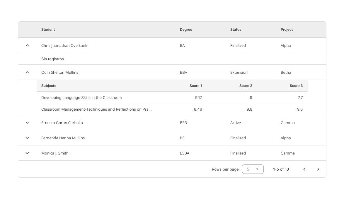
Normally, the headers of a table have a different color than its rows. In this case, child tables use a lighter color for headers in comparison to the main table.
Mobile
In lower resolutions, vertical and horizontal scrollbars appear to navigate the table columns and rows.
Specs
The font size and icon size for table elements are summarized as follows:
| Element | Font size (px) | Font weight | Icon size (px) |
|---|---|---|---|
| Title | 18 | Semi-bold | No icon |
| Actions | 14 (uppercase) | Semi-bold | 20 |
| Chip filters | 12 | Regular | 12 |
| Compact tables (default) | |||
Header | 12 | Semi-bold | 20 (checkbox only) |
Row | 13 | Regular | 20 |
| Comfortable tables | |||
Header | 12 | Semi-bold | 20 (checkbox only) |
Row | 14 | Regular | 20 |
Compact
Comfortable
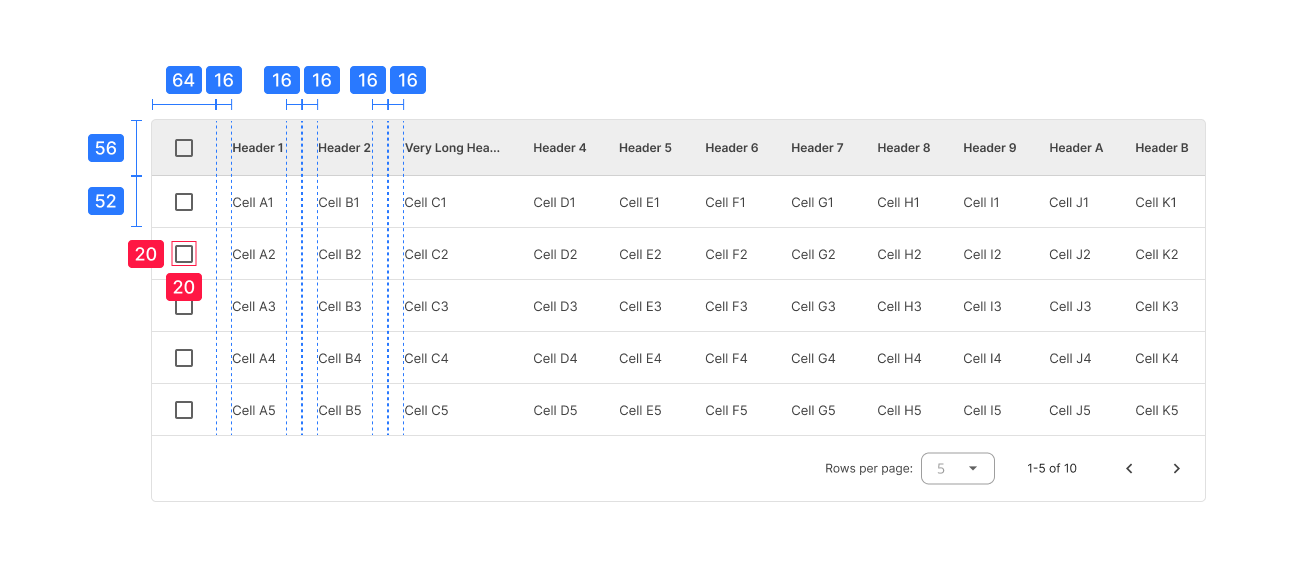
Columns that have numeric values MUST be right-aligned.
Color usage
- neutral-300 for table borders and dividers.
- neutral-200 for the main table header.
- neutral-100 for the child table header.
- alternate-50 as the background color for even rows inside a striped table.