Appearance
Tabs
Tabs organize related content across different screens, data sets, and other interactions. They allow the user to navigate between groups of information within different views without leaving the same page.
Horizontal tabs

Vertical tabs

Principles
Scalable: A user interface CAN have as many tabs as needed.
Informative: Tabs organize content into categories to help users find different types of information.
Peers: Tabs are displayed close to each other as peers, in categories of equal importance.
When to use
Tabs are recommended when:
- Grouping related information into different categories, helping to reduce the cognitive load.
- Organizing content such as forms, settings, and dashboards so a user does not have to navigate away from their workflow to complete their task.
Horizontal tabs
Types
There are two types of horizontal tabs:
- Fixed
- Scrollable
Fixed
All tabs are visible on one screen, with each one at a fixed width. They don’t scroll to reveal more tabs.
There are two ways to calculate the tab’s width:
The width of the container divided by the number of available tabs.

The width of the widest tab label.

Cluster
Clustered fixed tabs SHOULD be used in wide horizontal layouts, and the tab bar COULD be centered, left-aligned or right-aligned.
Clustered to the center

Clustered to the left

Clustered to the right

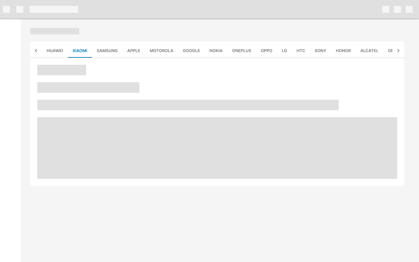
Scrollable
Tabs don’t have a fixed width. When there are more tabs than the screen can show in full width, the rest remain off-screen until scrolled and the width of each tab is defined by the length of its text label.
DON’T use inconsistent padding on each tab.
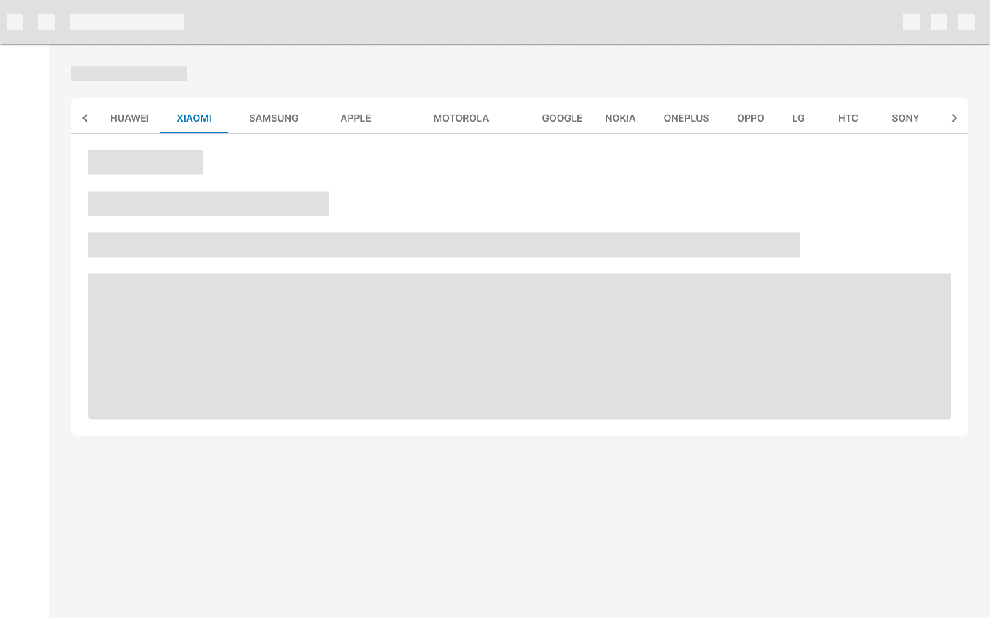
On desktop, include a visual indicator to show that more tabs are available off-screen.
On mobile devices, there is no visual indicator to show more items because the entire tab section can be swiped. Offset the first tab on the left to indicate that the tabs are scrollable and truncate the last visible tab that doesn't fit the screen.

Active tabs reposition themselves to appear fully on screen.
Design guidelines
Anatomy

- Container
- Tab icon (optional)
- Tab text label
- Active tab indicator
- Closure icon (optional)
- Tab item
Container
The tab container MUST have a border-bottom of 1px to differentiate it from the content it controls.

Tab icon
Icons are a simple and recognizable way of indicating what a tab may contain. But even though they are helpful, the text label is always more effective at communicating complex content. Icons for horizontal tabs are optional.

DON’T use a combination of simple tab labels and tab labels with icons.

Avoid using only icons in tabs as an icon’s meaning may not be clear on every topic.
 Tabs on mobile may include icons only to benefit from the screen size.
Tab text label
Even though it's not recommended, there could be cases where the text inside a tab item needs to be longer (for specific user needs).
Longer text labels could take up all the horizontal space.
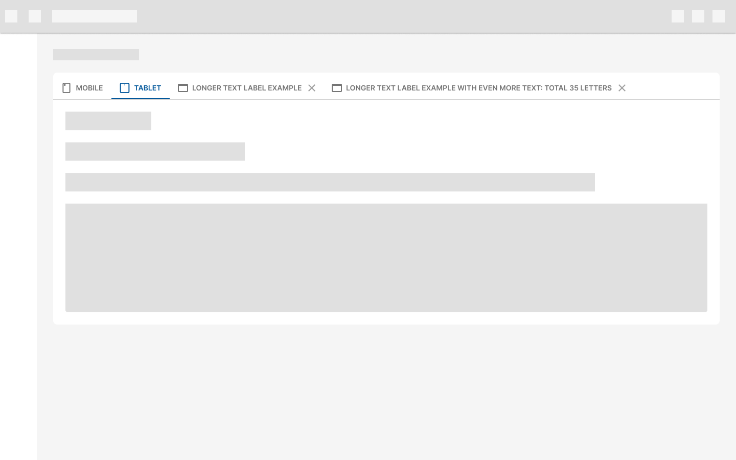 The use of longer text labels for tab items must be validated beforehand.
Active tab indicator
To differentiate an active horizontal tab from an inactive tab, apply an underline and color change to the active tab’s text and icon.
To check other horizontal tab states, check Behavior.
Closure icon
When there is a need to programmatically create more tabs on demand, new tabs SHOULD be dismissible. To show that a tab can be closed or dismissed, we show a closure icon that should always be shown next to the label (to the right).

When using a combination of static tabs and dismissible tabs, the static tabs should be placed at the beginning (2 max) and then the dismissible tabs one after the other.

Placement
Layout
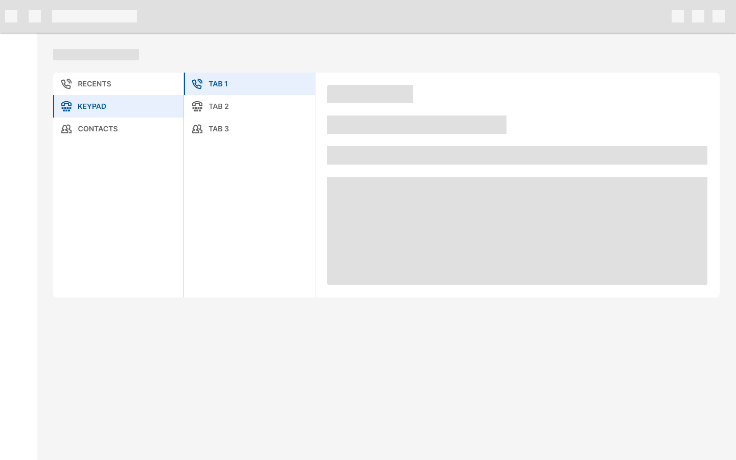
Horizontal tabs are displayed in a single row, with each tab connected to the content it represents.
Nesting
Avoid nesting horizontal tabs within another horizontal tab.

If another tab set is needed, you SHOULD use the Vertical variant.
The max number of nested tabs, when the first tab set is horizontal, is 3.
The use of nested tabs must be validated beforehand.
Placement
Horizontal tabs control the region below them.
DON’T place horizontal tabs above content they don’t control. 
- Tab content2. Content outside of tab's control :::
Behavior
States

Specs
The font size for the tab labels is 14px and the text is capitalized by default.
Desktop/mobile measurements


The use of upper/lower case text for tab items must be validated beforehand.
There is no need to add additional spacing between the tab container and the element where it's placed, such as cards or sheets.

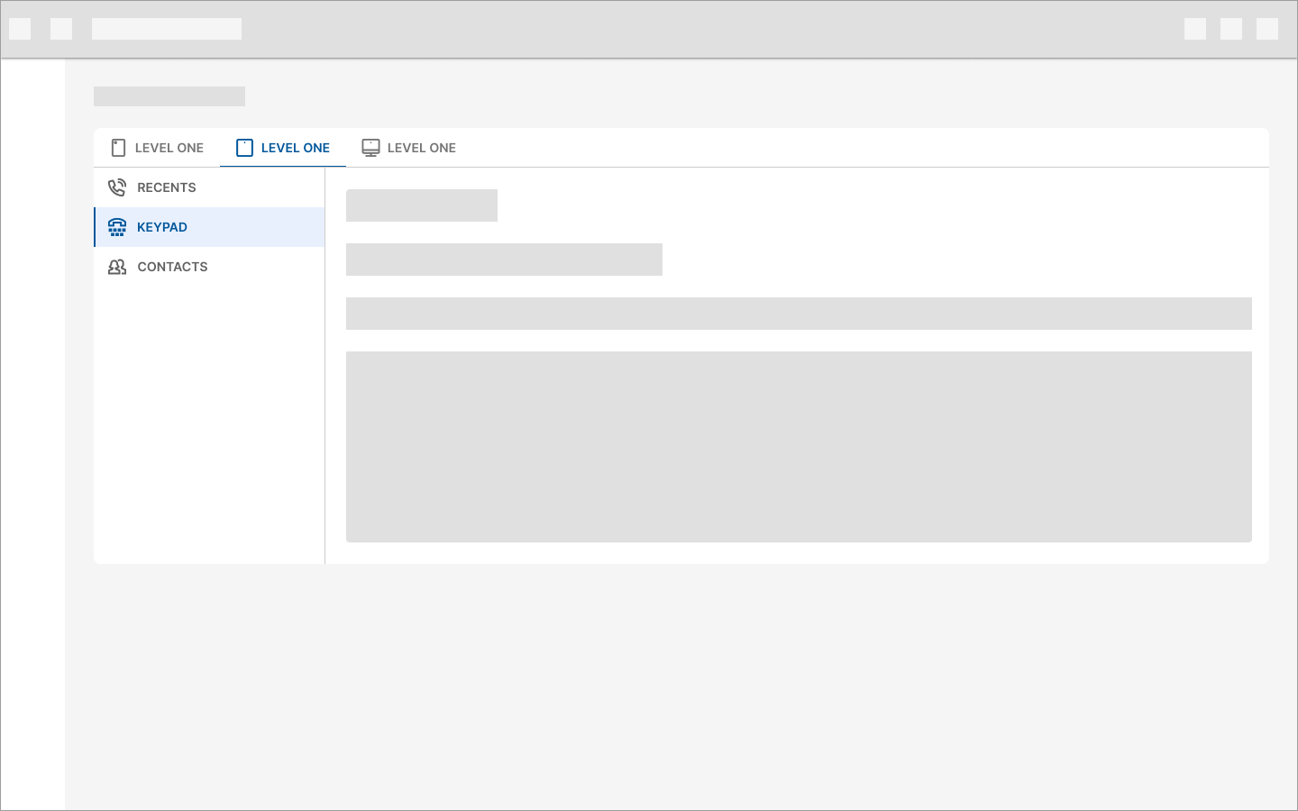
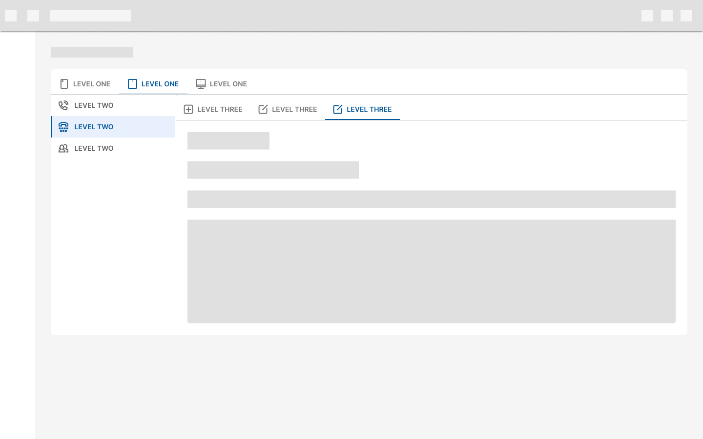
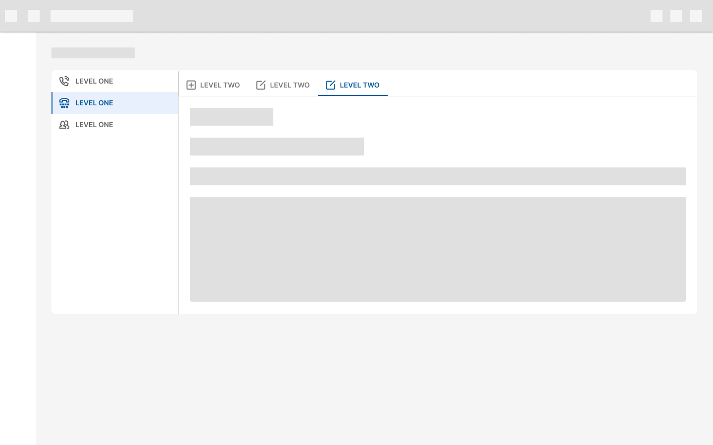
Vertical tabs
Design guidelines
Anatomy

- Container
- Tab icon (optional)
- Tab text label
- Active tab indicator
- Closure icon (optional)
- Tab item
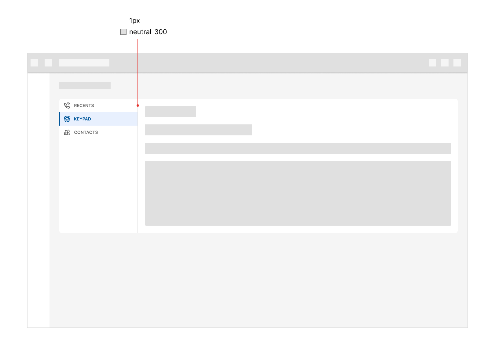
Container
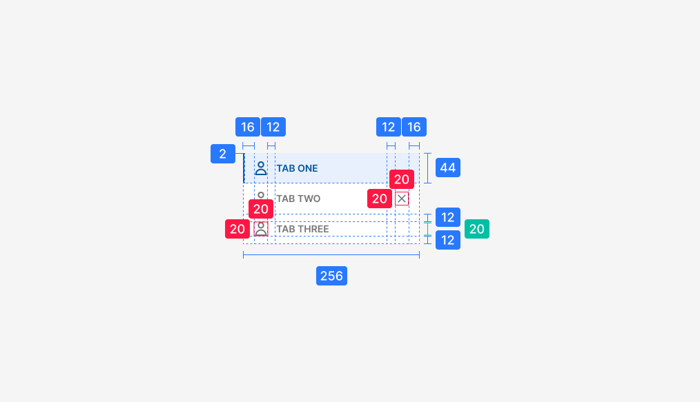
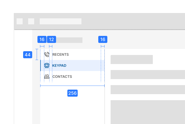
The tab container MUST have a border-right of 1px to differentiate it from the content it controls.
Tab icon
Icons for vertical tabs are optional, but they MUST be placed to the left of the label.
Active tab indicator
To differentiate an active vertical tab from an inactive tab, apply a different background and color change to the active tab’s text and icon as well as a colored border for the left side of the tab.
To check other vertical tab states, check Behavior.
Placement
Layout
Vertical tabs are displayed in a single column, below one another. They control the region right next to them.
The maximum number of vertical tabs to be displayed must not be greater than the height of their container.
Nesting
Avoid nesting vertical tabs within another vertical tab.
If another tab set is needed, you SHOULD use the Horizontal variant.
The max number of nested tabs, when the first tab set is vertical, is 2.
The use of nested tabs must be validated beforehand.
Behavior
States

Specs
The font size for the tab labels is 14px and the text is capitalized by default.
Measurements
The use of upper/lower case text for tab items must be validated beforehand.
There is no need to add additional spacing between the tab container and the element where it's placed, such as cards or sheets.
Other examples
The text inside each tab item CAN be changed to lowercase when it's too long.
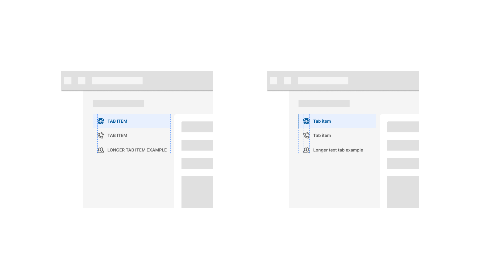
If the text touches the padding to the right, it's probably too long to be in all caps. This applies to horizontal and vertical tabs.