Typography
Typography is an important part of a design system that brings consistency across experiences and platforms. Good typography rules help present content clearly and efficiently.
Open Sans is our corporate typeface. It has been carefully selected to meet our needs as a educational organization and reflect our brand spirit and design principles.
Type scale
Our type scale includes a range of contrasting styles that support the needs of a product and its content.
Headings
In the type scale, headlines span from a range of 1 through 6. Headlines are the largest text on the screen, reserved for short, important text or numerals.
| Style | Properties |
|---|---|
H1 |
Font size: 32px, Line height: 40px, Letter spacing: -2% |
H2 |
Font size: 28px, Line height: 36px, Letter spacing: -2% |
H3 |
Font size: 25px, Line height: 36px, Letter spacing: -2% |
H4 |
Font size: 22px, Line height: 32px, Letter spacing: 0% |
H5 |
Font size: 20px, Line height: 28px, Letter spacing: 0% |
H6 |
Font size: 18px, Line height: 24px, Letter spacing: 0% |
Titles
Titles are the medium text on the screen, reserved for titles and important text or numerals in the most of applications.
| Style | Properties |
|---|---|
Large |
Font size: 22px, Line height: 32px, Letter spacing: 0% |
Medium |
Font size: 20px, Line height: 28px, Letter spacing: 0% |
Small |
Font size: 18px, Line height: 24px, Letter spacing: 0% |
Paragraphs
Paragraphs styles are typically used for long-form writing as it works well for small text sizes of text in your app. For these longer sections of text, a serif or sans serif typeface is recommended.
| Style | Properties |
|---|---|
Large |
Font size: 16px, Line height: 24px, Letter spacing: 0% |
Medium |
Font size: 14px, Line height: 20px, Letter spacing: 0% |
Small |
Font size: 12px, Line height: 20px, Letter spacing: 0% |
XSmall |
Font size: 11px, Line height: 16px, Letter spacing: 0% |
Overline |
Font size: 14px-12px, Weight: Semibold, Line height: 20px, Letter spacing: 1% |
Button |
Font size: 14px, Weight: Semibold, Line height: 26px, Letter spacing: 0.5% |
Text formatting
Text formatting can be used to visually add clarity and adjust voice or meaning.
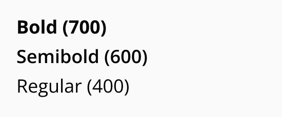
Weights
Weights are used to add emphasis and differentiate content hierarchy. Weights like bold and semibold should not be used for long text.
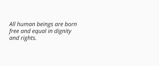
Italic
Italic style should only be used when you need to emphasize certain words in a sentence such as technical terms, names of devices, captions.
Resources
Download the family font from Google.